SCREEN
- ERA
- ANCIENT STENCIL — HAND-PULLED
- COLOUR
- SPOT · FLAT · OPAQUE ON DARK
- CEILING
- COST SCALES WITH COLOUR COUNT
- KILLS A MARK
- FINE DETAIL, MULTI-TONE WORK

HERALDIC SPECIFICATION · POINT PAPER / SCREEN / LOOM
A blazon is the formal written description of a coat of arms — the text from which any herald can redraw the same arms, anywhere, without seeing the original. It is a specification, not a picture. This page is one you can operate.
01 / THE BRIEF
Almost Gods — independent label, New Delhi, est. 2018.
“Create prints, patterns and seamless designs for the brand using the Alpha Cross, and creative thinking that complements the brand aesthetic.”
Almost Gods gave me their Alpha Cross and asked for prints. A single mark repeated is wallpaper — so I treated the cross as a heraldic charge and built an armory around it, then specified the whole system across four production methods, from hand-pulled screen to jacquard loom.
02 / THE ARMORY
One seed, four operations. The cross sits alone at centre as the charge; everything else in the system branches off it.
Almost Gods handed me one mark — the Alpha Cross — and asked for prints, patterns and seamless designs that complement the brand.
The obvious answer is to repeat the logo. That answer fails. A mark repeated is wallpaper; it produces merchandise, not a collection. So the first decision was to read the brief as asking for a system rather than a tiling, and the second was to choose heraldry as the model for it.
Heraldry is a grammar: field, ordinary, charge and tincture combine under rules to generate an unlimited armory in which everything is legibly family. It is also the visual language of institutional power, which is the label's entire subject. Borrowing the grammar rather than the imagery meant the collection could grow without drifting.
Then the decision that shaped everything else. The brief said prints. I took the range into woven cloth as well, because a printed cross is a picture of authority and a woven cross is authority built into the structure of the garment. For a label about power, that distinction is not decorative.
That choice set the ceiling. At 100 ends by 80 picks per inch a motif has a fixed cell budget, and fine line weight, gradients and floating detail collapse into noise. Print has no such ceiling — resolution is free — which is exactly why most streetwear graphics do not survive weaving.
So the loom became the design authority. Every mark was drawn to survive weave first and enriched afterward.
That inversion improved the work. Reduction forced each mark into a single continuous mass with legible negative space, which is what a heraldic charge already is. The constraint pushed the imagery closer to the tradition it was borrowing from.
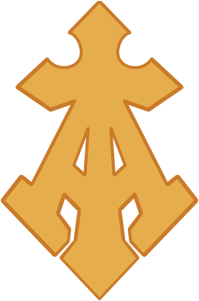
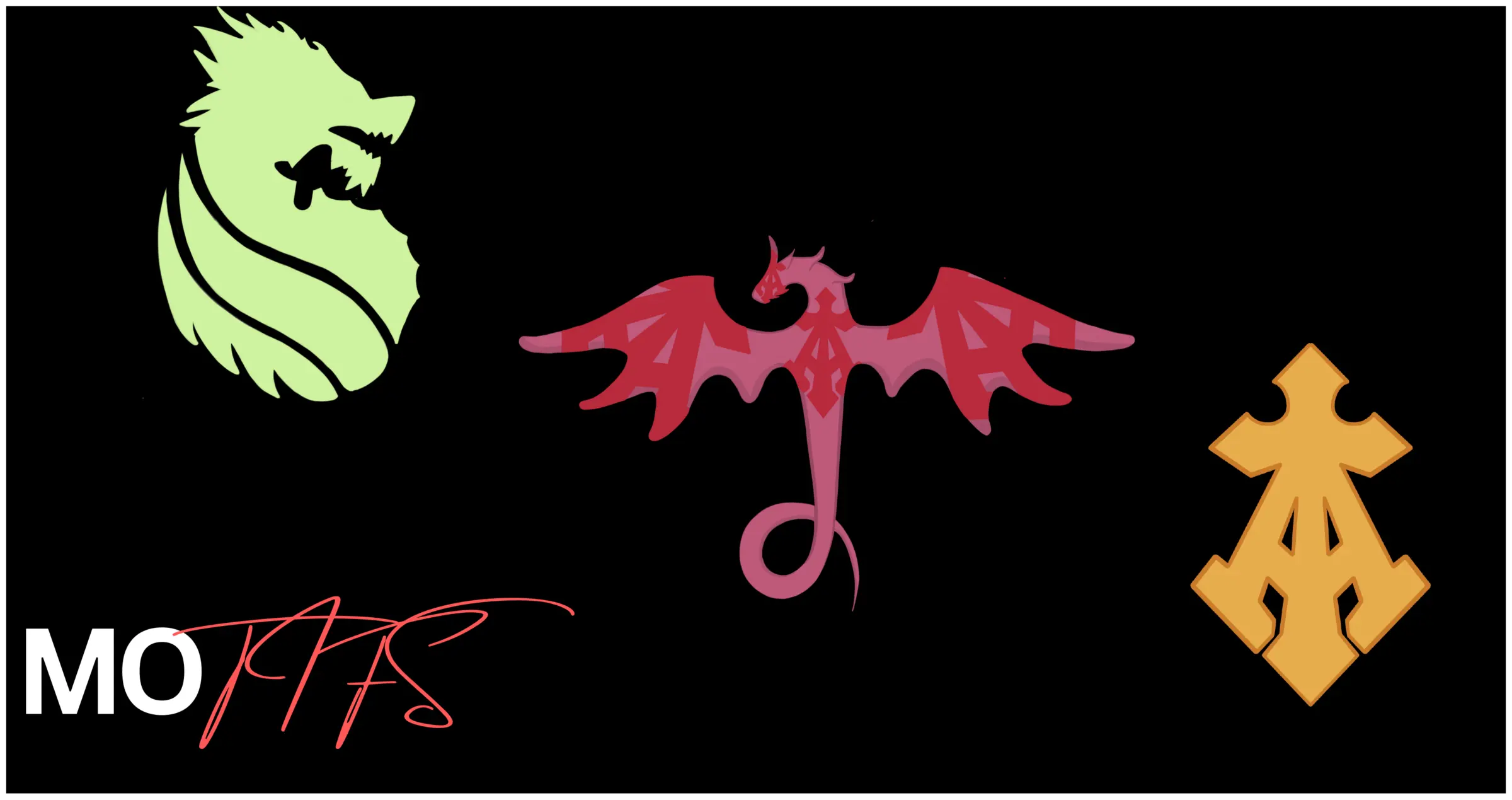
The Alpha Cross is the charge — the given, and the only element that came with the brief. Symmetric enough for block repeat, sharp enough to hold at loom density, it became the sign the whole system was calibrated around.
The winged cross is an augmentation: wings added to an existing charge, historically the mark of honour granted for service. It carries the collection's flight and ascent register, and its span is what makes a half-drop layout work.
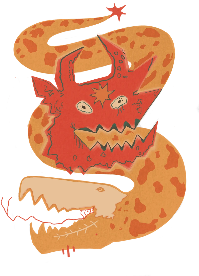
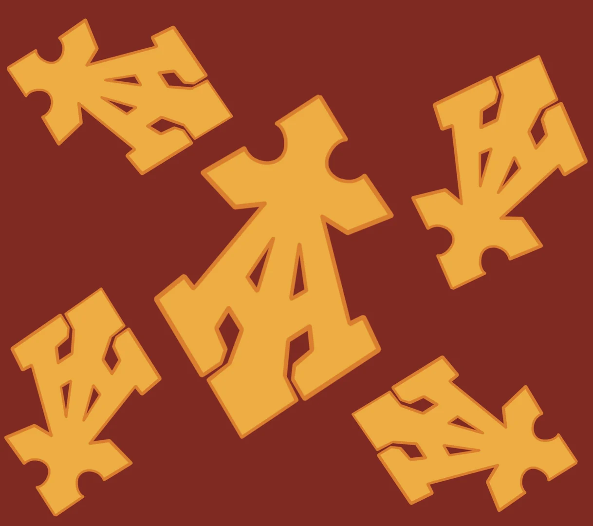
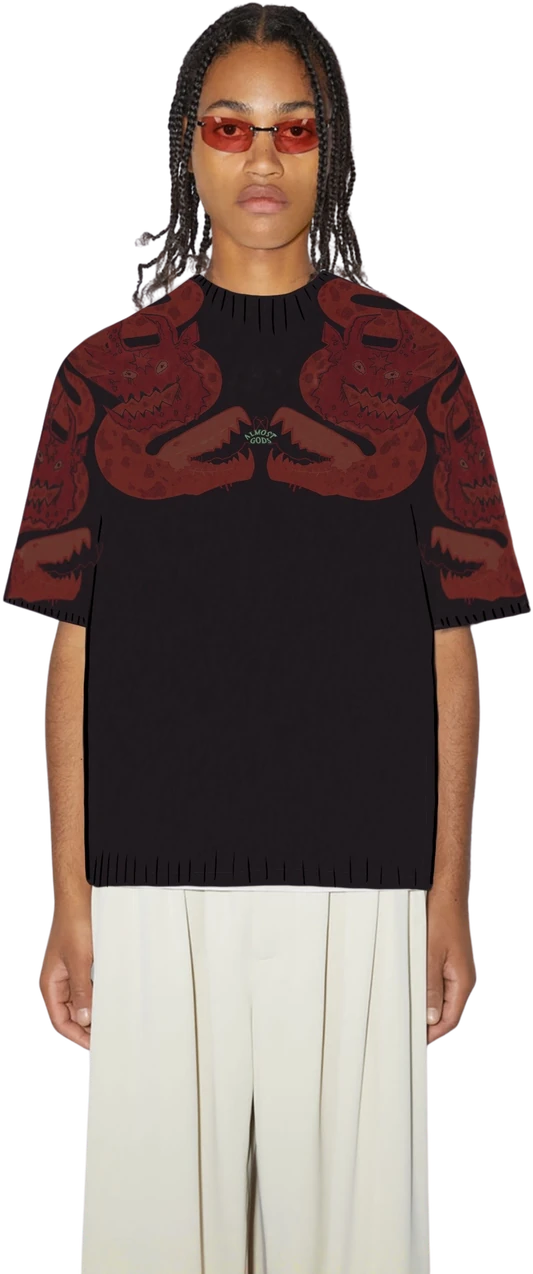
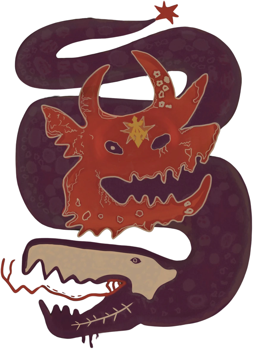
The beasts are supporters — the dragon and the coiled serpent forms that flank and enclose the charge. They are the loudest marks in the system, and they survive reduction because a coil is already a single continuous mass.
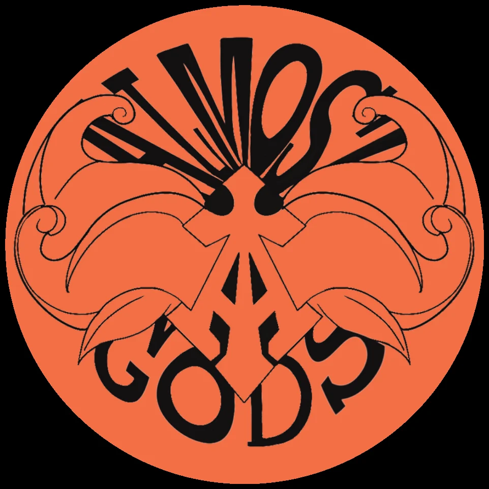
The roundel encloses the cross in a seal. It is the formal mark, reserved for closures, labels and small placements rather than field pattern.
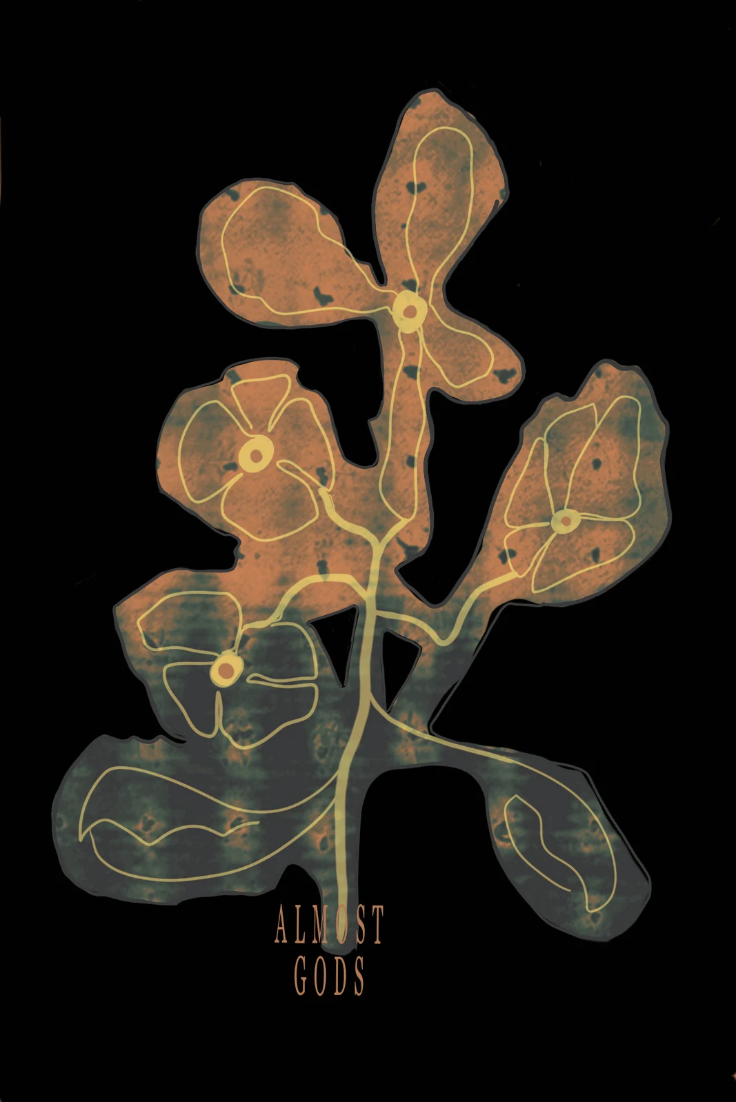
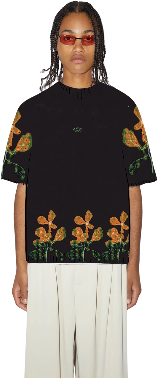
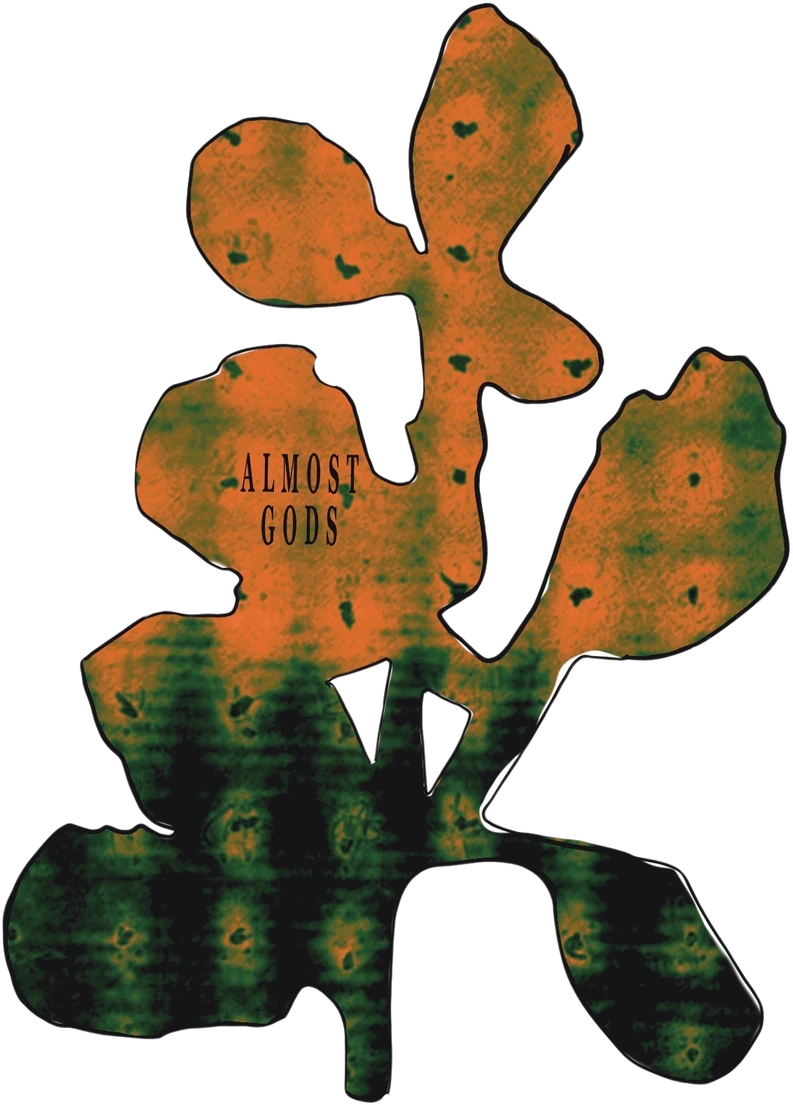
The botanical is semé: a field strewn with small charges. It carries the lightest tonal weight in the system and does the work of a ground rather than a figure.
03 / MOODBOARD
Warm and dense. A European grammar of power, an East Asian beast, an Indian field — syncretic, and deliberately so.
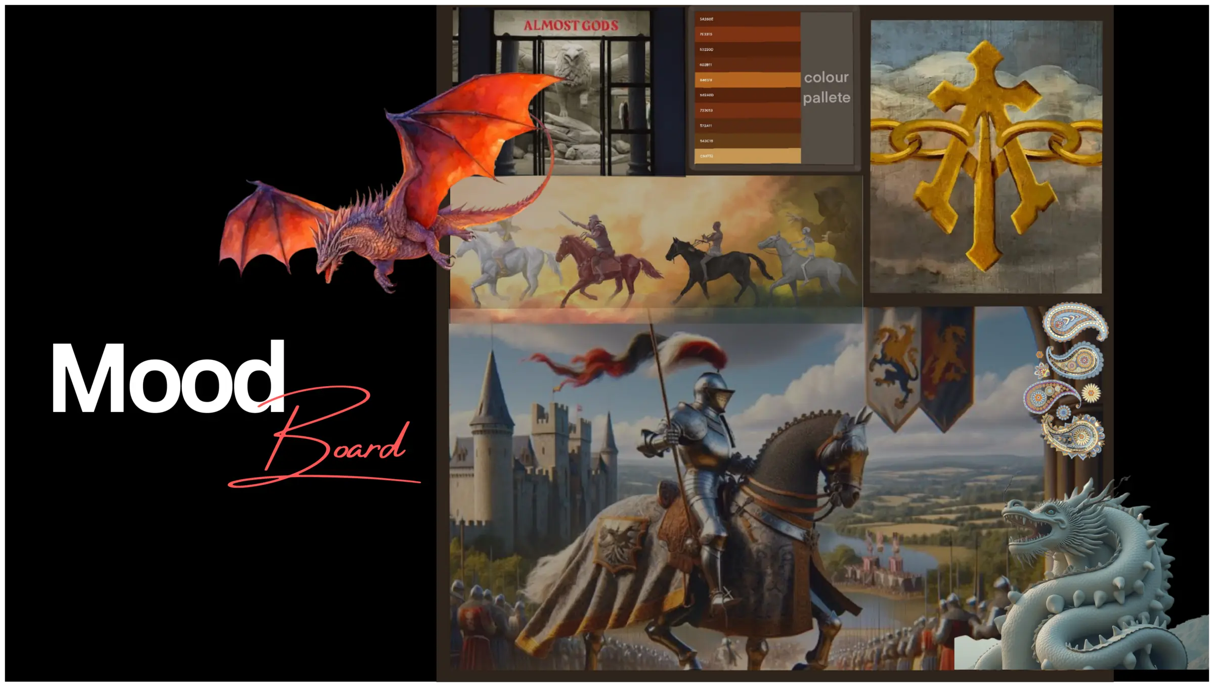
That combination is the point: a European grammar of power, an East Asian beast, an Indian field. Syncretic, and deliberately so — which lines up with the label's stated project of renegotiating India's place in a global conversation rather than illustrating it.
Two registers, one palette. The printed half runs hot — vermilion, coral, acid, bone: flat, graphic, frontal light, poster logic, punk lineage. The woven half runs heavy — oxblood, brick, ochre, sand, tarnished gold: low raking single-source light, the twill diagonal always visible. If you cannot see the interlacement you have made a print again. Vestment, not Halloween.
They share seven values and the same armory; shooting them differently is deliberate art direction. Palette fixed at seven values: void, oxblood, brick, crimson, ochre, sand and bone. Acid green appears exactly once in the whole system — scarcity is the point.
04 / METHOD
Screen print, digital, DTF and jacquard — roughly four centuries of machine. The production method carries the timeline the imagery only describes.
Stencil printing is ancient; the jacquard loom is 1804, and its punched card is the ancestor of computing; digital is contemporary; DTF is the newest thing in the room. The label reads power across past, present and future — so the production method carries the timeline the imagery only describes.
05 / COMPOSITION
Each mark runs through five layout logics — block, half-drop, brick, mirror and toss. Block reads institutional, brick utilitarian, toss chaotic. The label's register moves between uniform and relic, so layout is doing narrative work rather than filling space.
06 / STRUCTURE
Selecting Plain, Twill 1/7 or Multiple structure 2 resolves the mark from flat silhouette into interlaced warp and weft, cell by cell. Move across the cloth to read float length.
The interactive study renders interlacement from a binary matrix rather than an image, so the weave is computed at stated density rather than drawn to resemble it.
07 / LOOM
Light, technical, exact. The specification sheet at full bleed, with the numbers that make every other section possible.
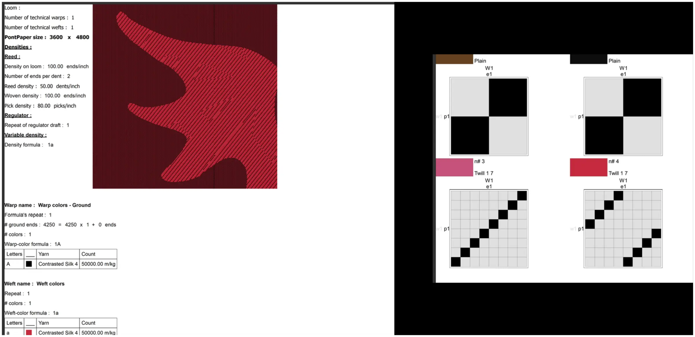
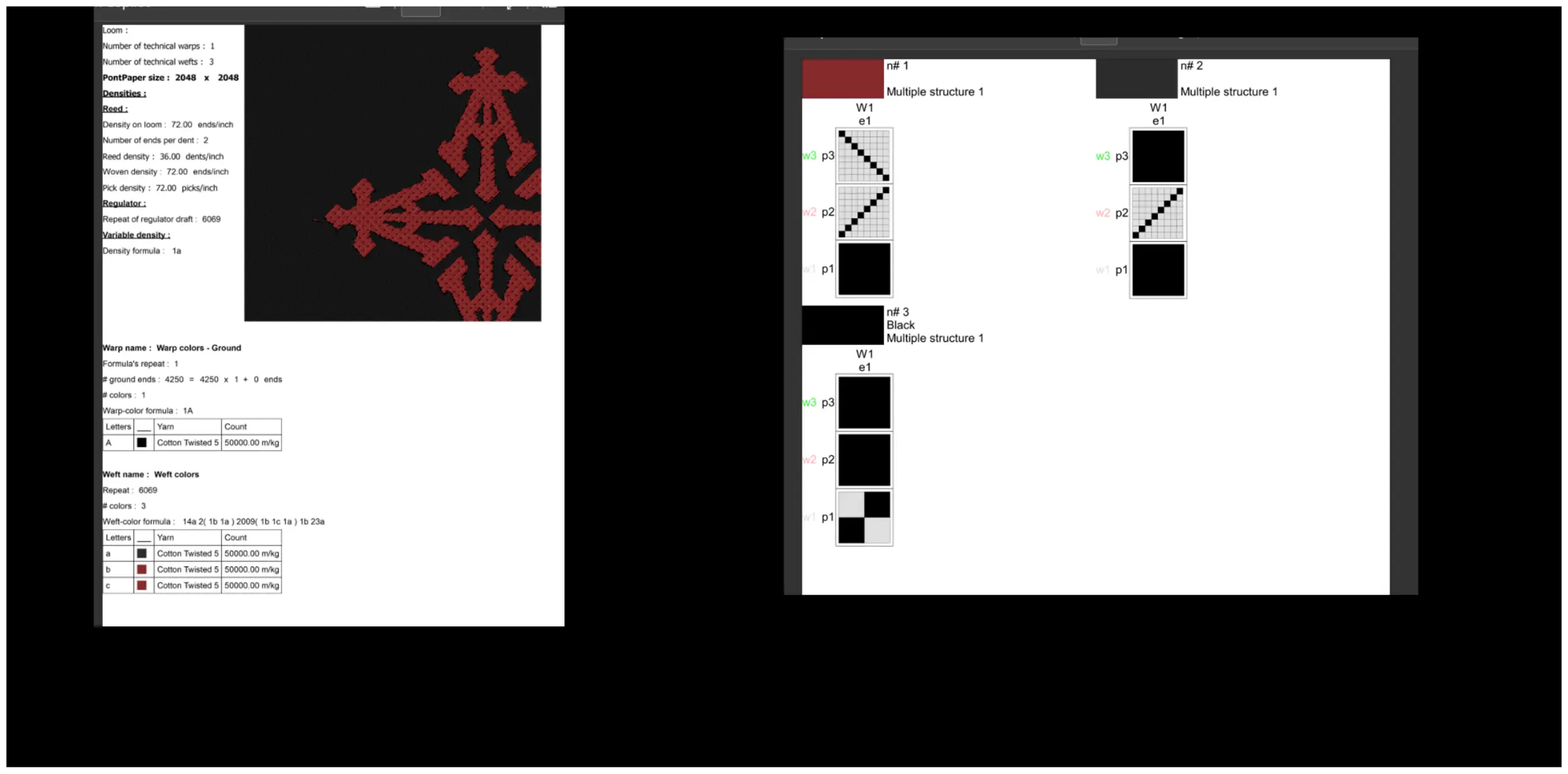
Point paper 3600 × 4800. One technical warp, one technical weft. Warp: 4250 ground ends, single colour, Contrasted Silk 4 at 50000 m/kg. Weft: matching count, one colour per structure. Reed 50 dents per inch at 2 ends per dent, giving 100 ends per inch on loom. Pick density 80 per inch. Regulator draft repeat 1, density formula 1a.
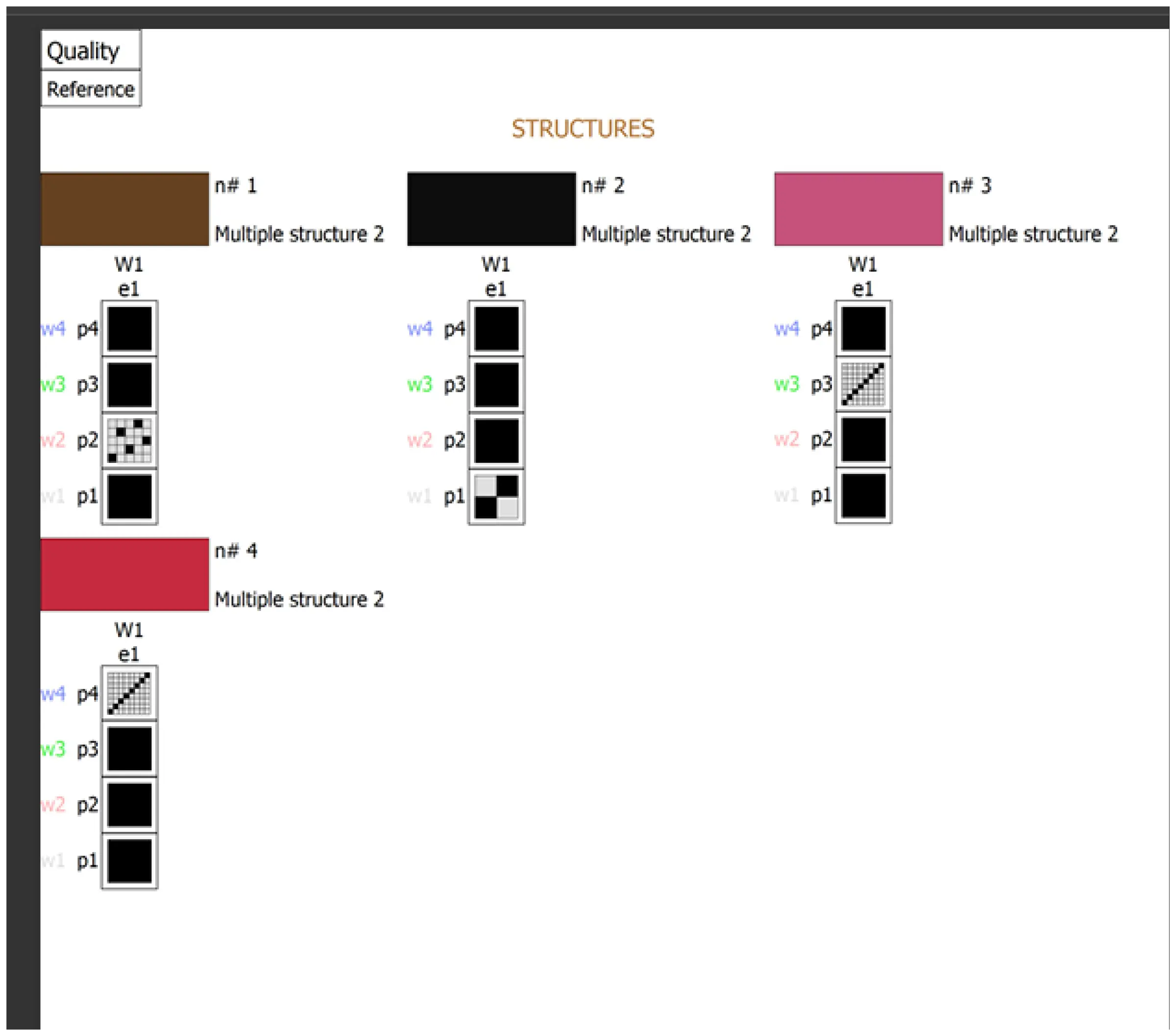
Structures: Plain for open grounds. Twill 1/7 for tonal depth without a colour change. Multiple structure 2 for the two-colour cloths.
08 / CLOTH
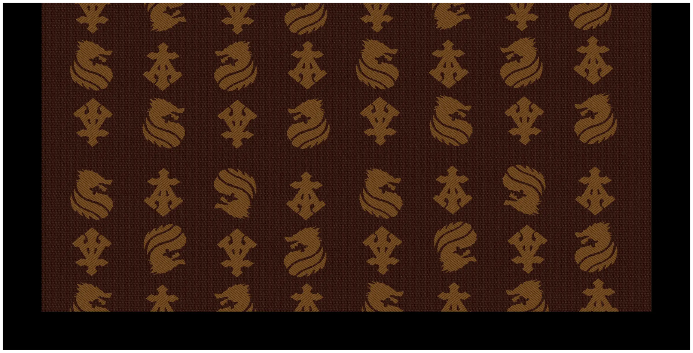
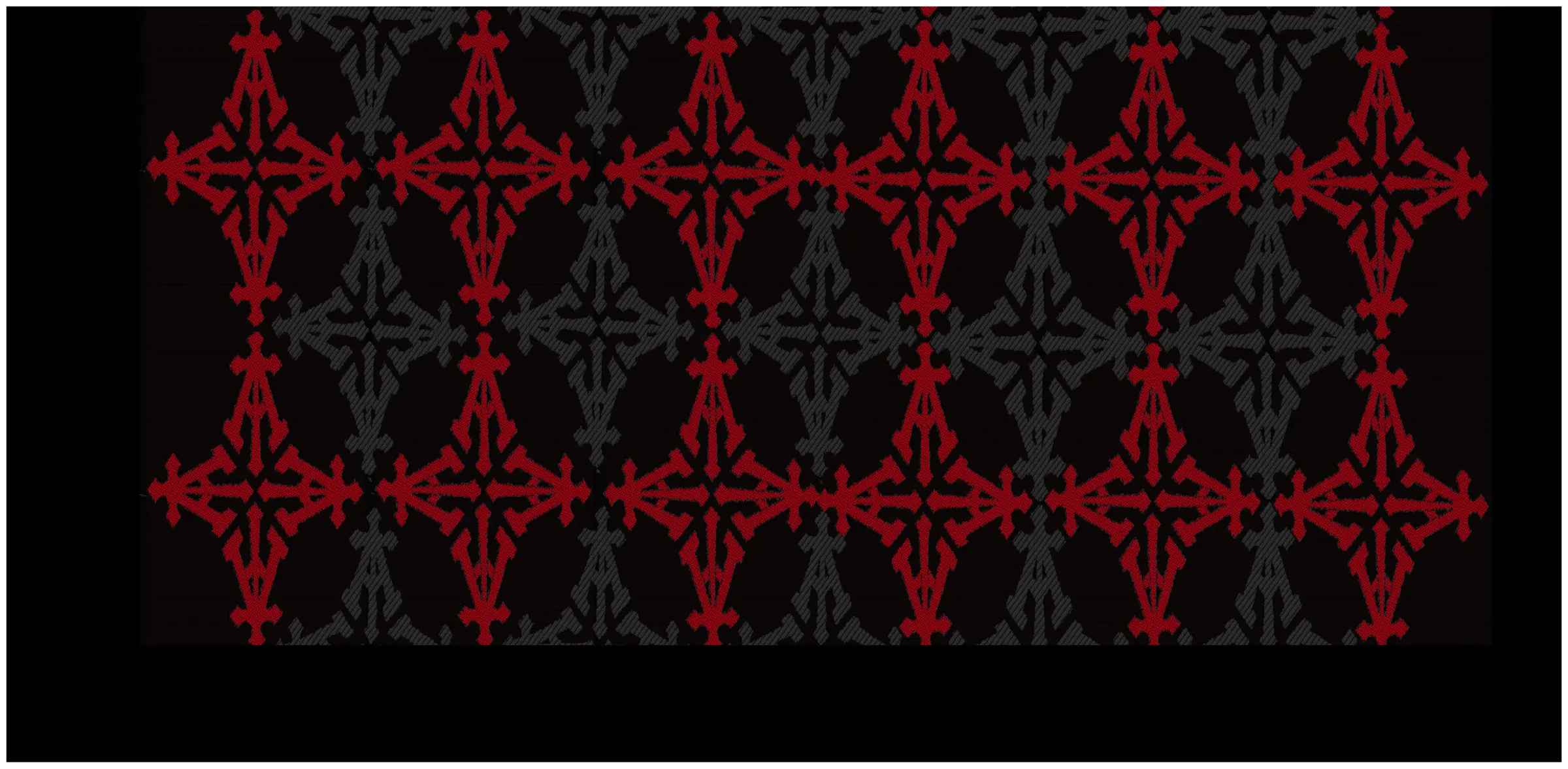
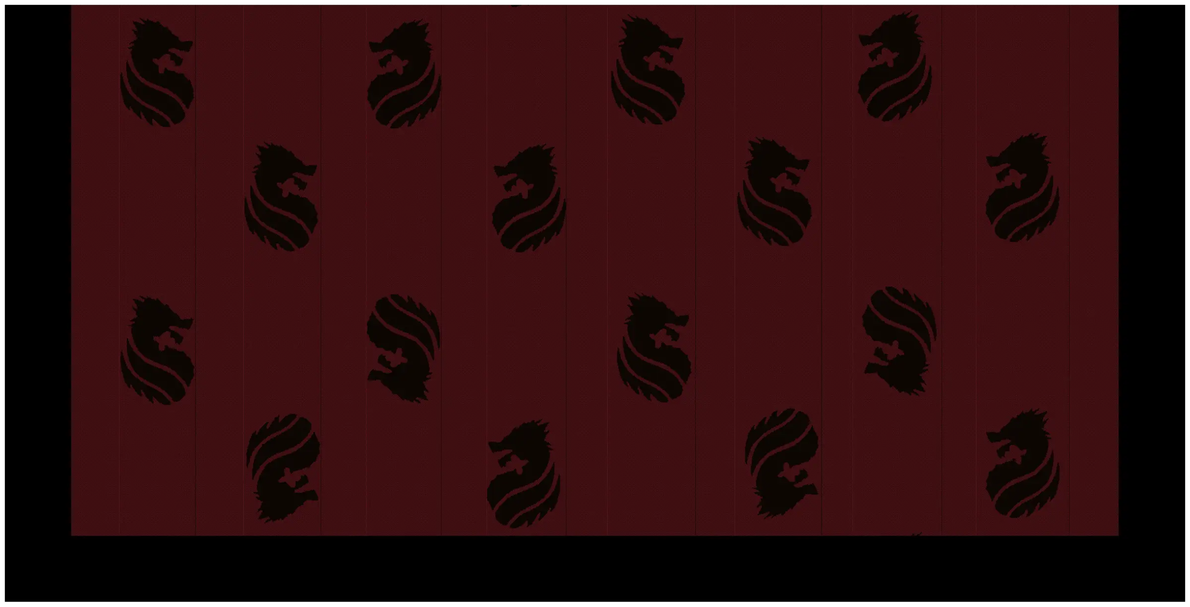
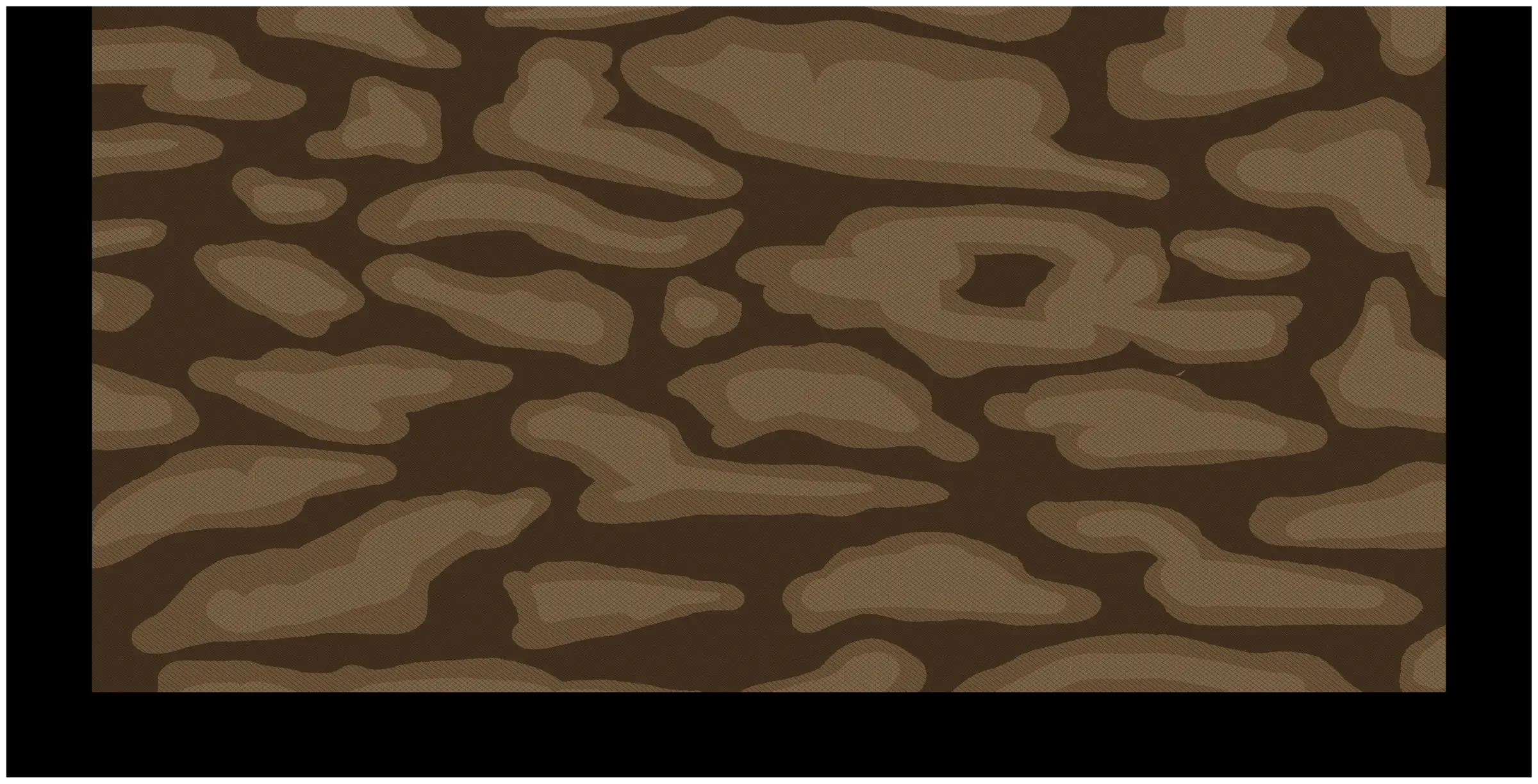
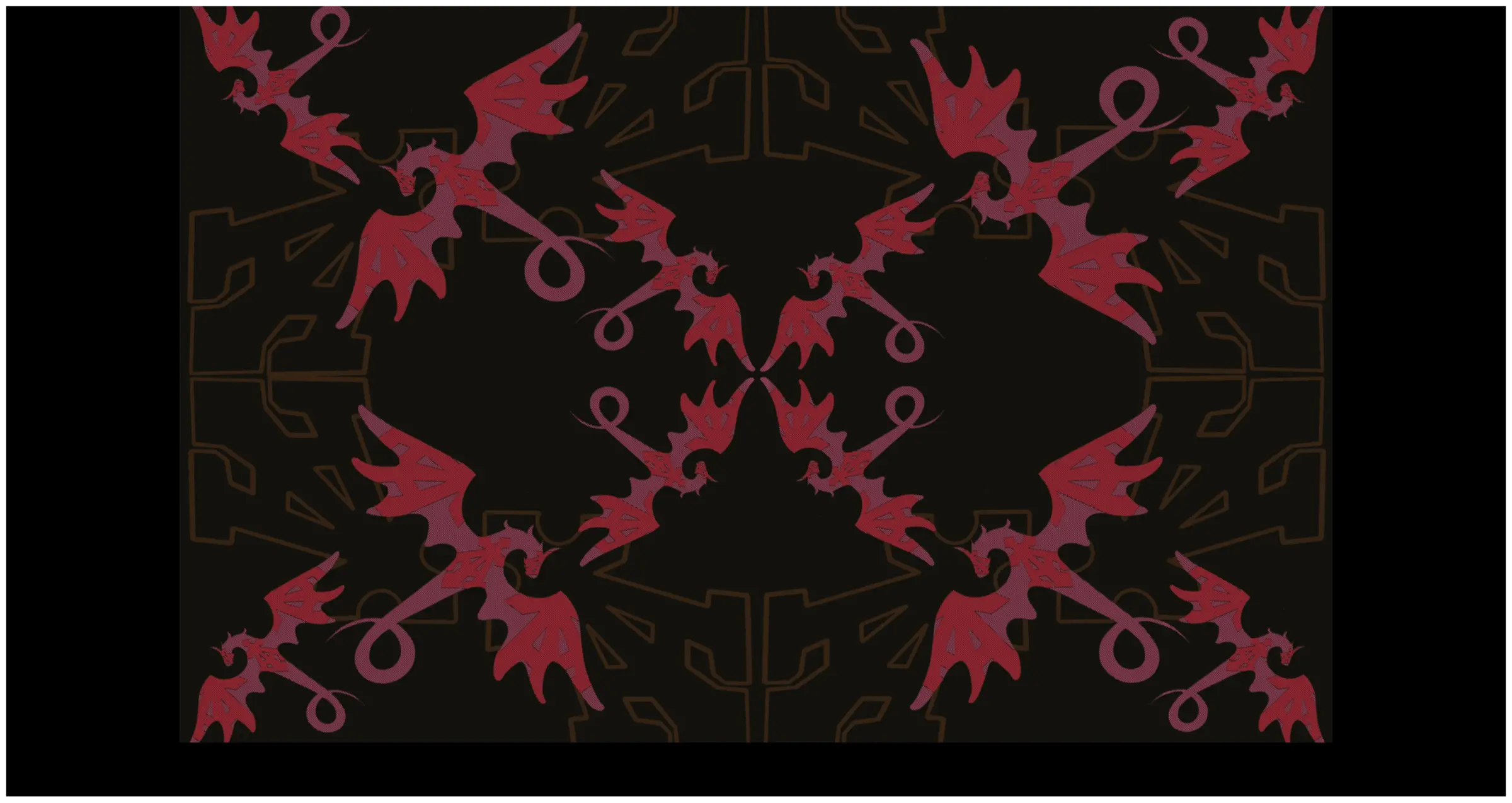
Warm, loud, full bleed. Drag across the weave at 1:1 — CAD renders at true density, not photographs.
09 / PRINTED
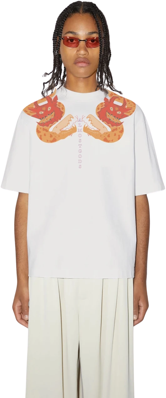
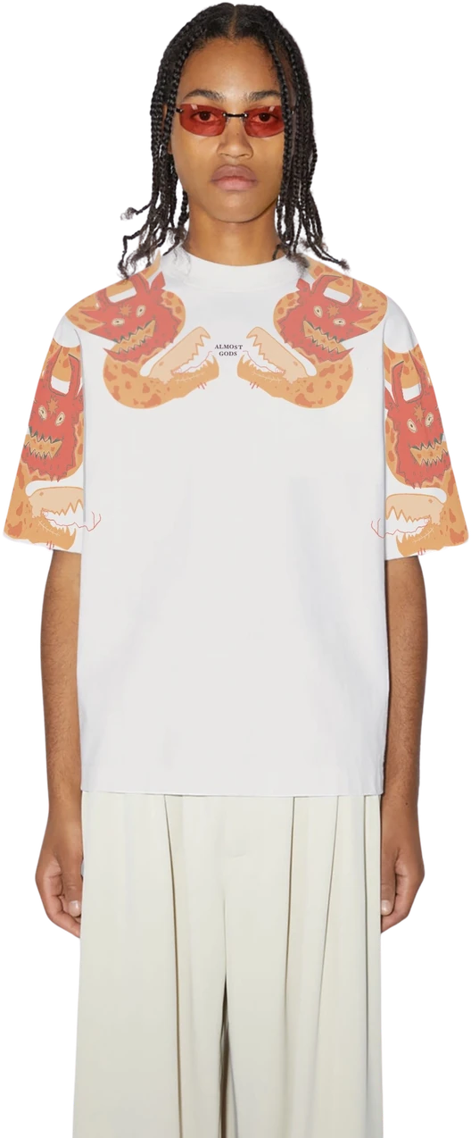
Method assigned by intent, not convenience. Vermilion, coral, acid, bone — poster logic, punk lineage.
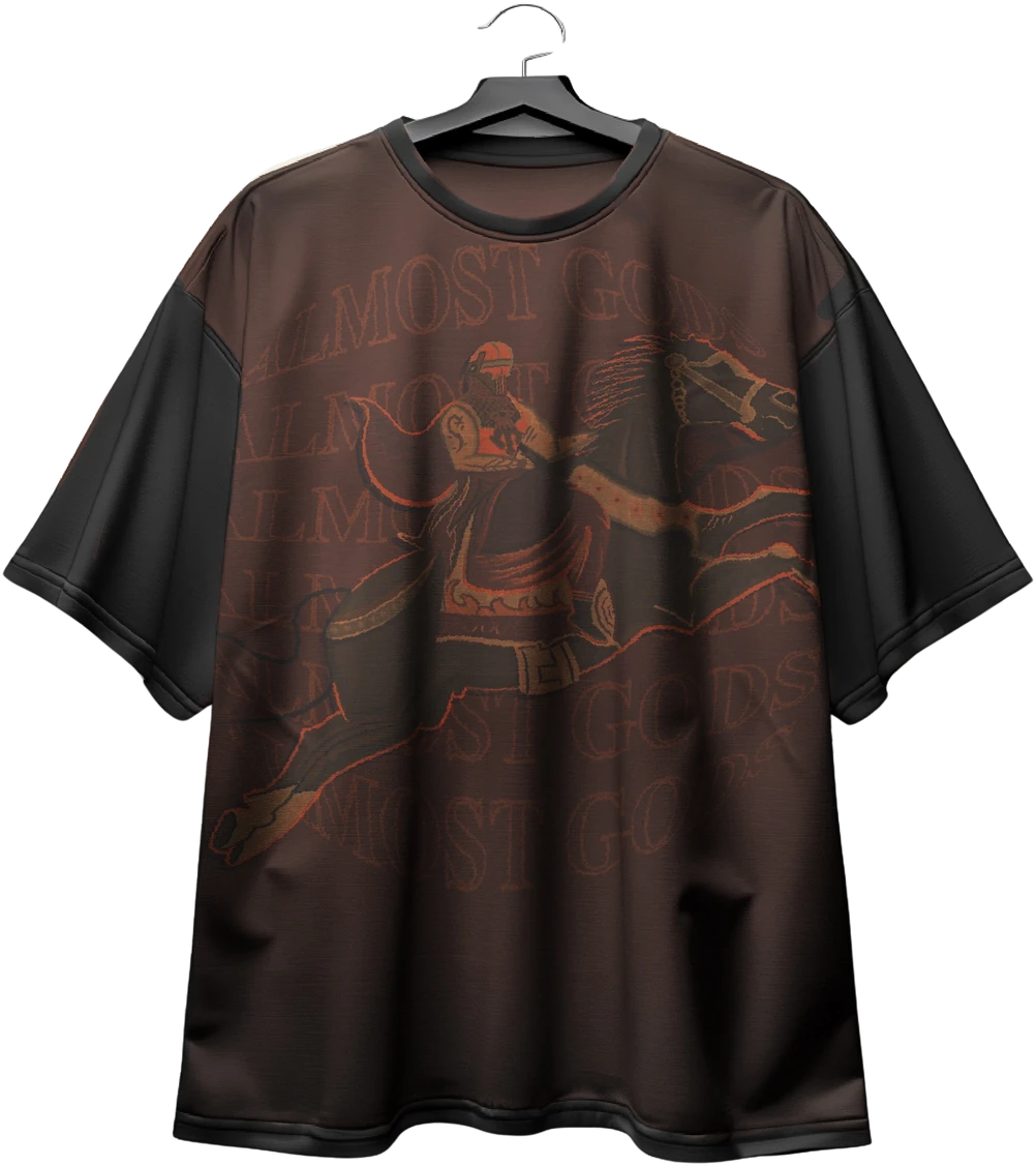
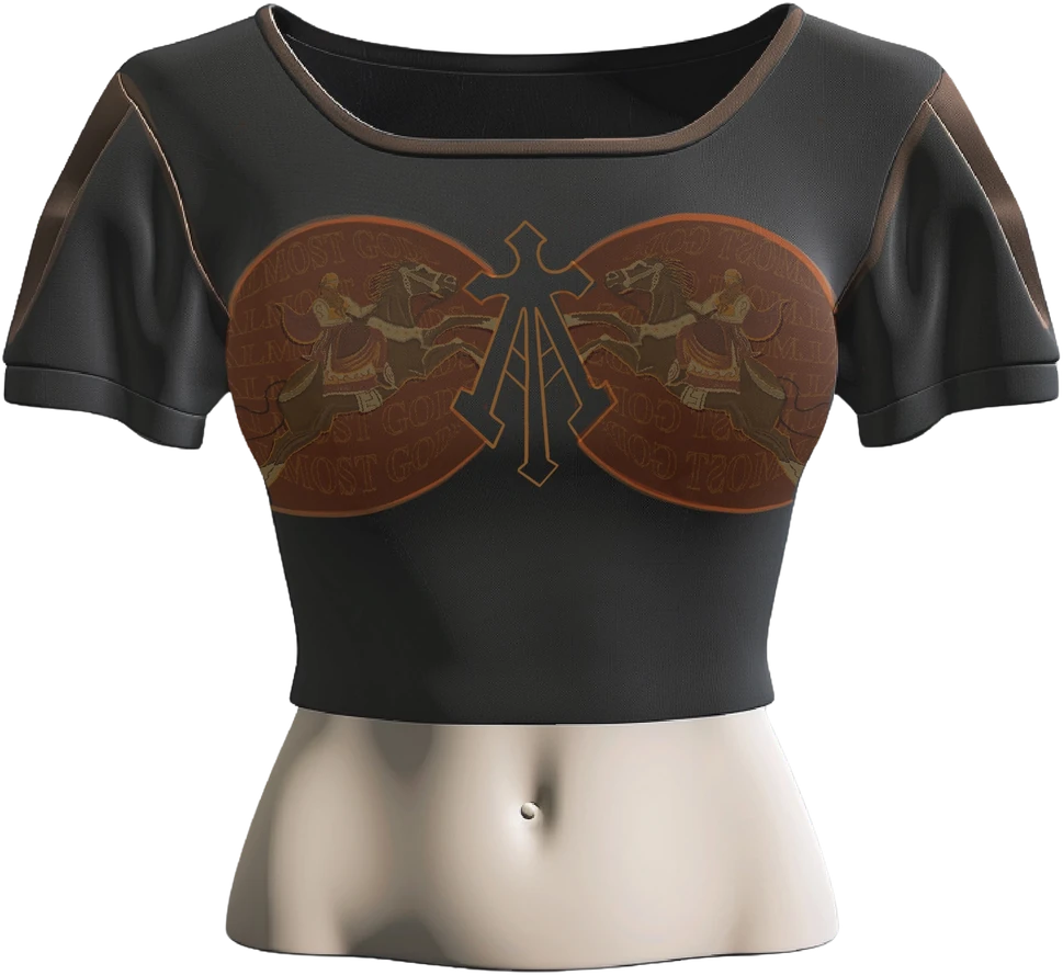
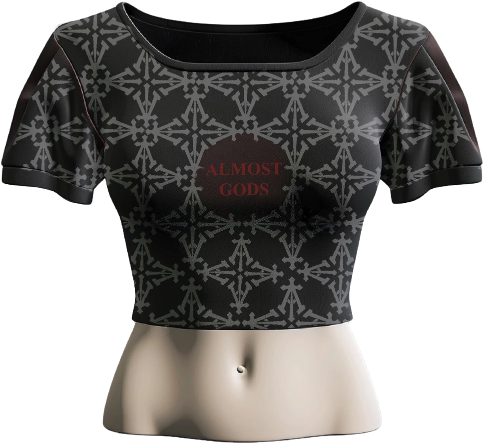
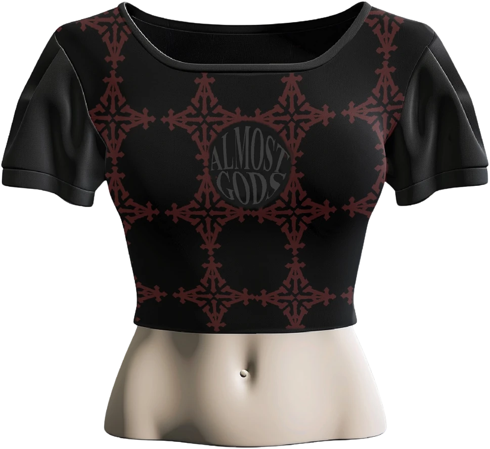
Screen print carries the pieces that should read as poster or band tee — flat, spot colour, opaque on dark grounds; cost scales with colour count rather than quantity.
DTF and digital carry the photographic and multi-colour work, where a mark needed detail no screen could register and no loom could hold.
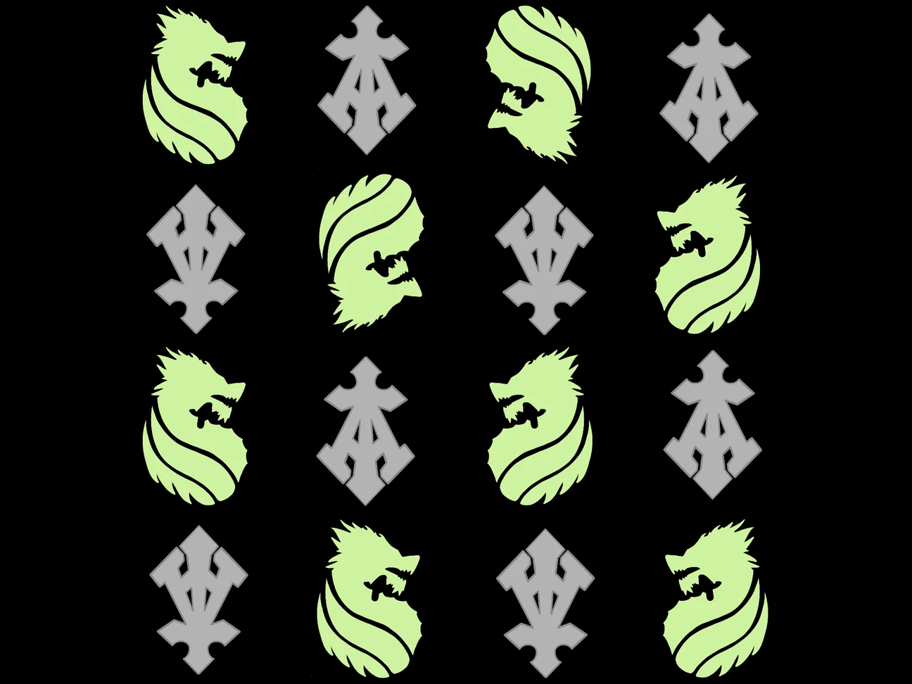
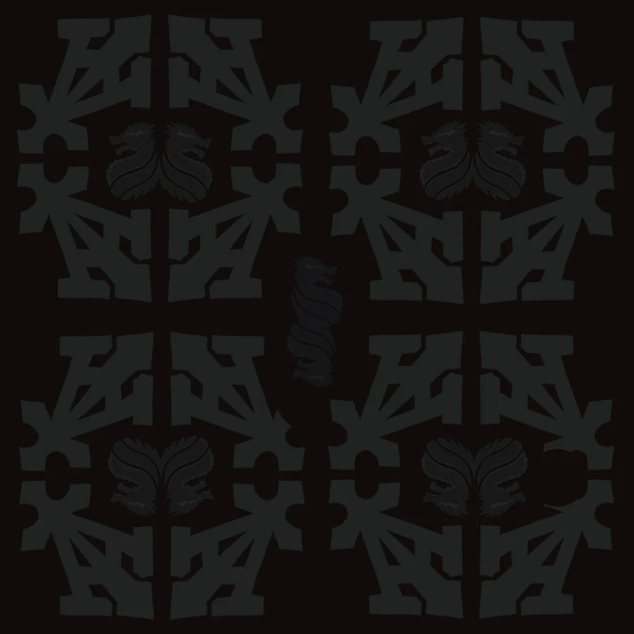
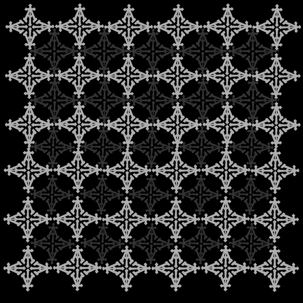
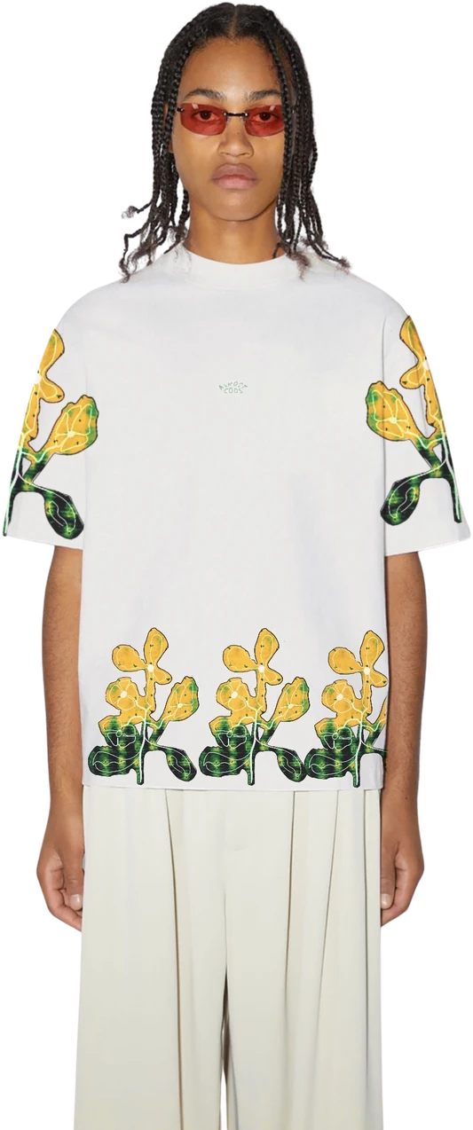
GRID / ACID SEAM — SCREEN
A seam-grid repeat in spot colour, built for the screen. The system's single acid strike lives here — flat, frontal, block layout.
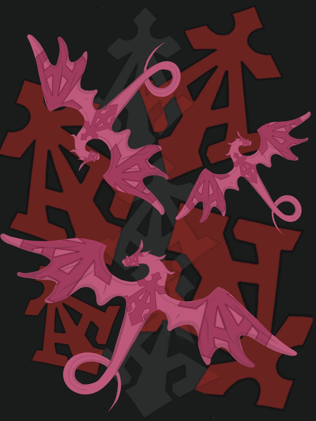
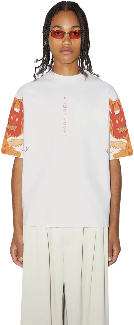
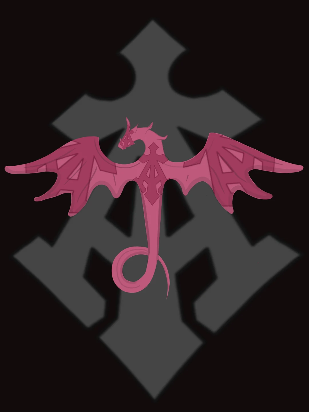
DRAGON / PINK FIELD — DIGITAL
The loudest supporter in the hot register, set as a poster rather than a pattern. Digital print — detail no screen could register, held at full resolution.
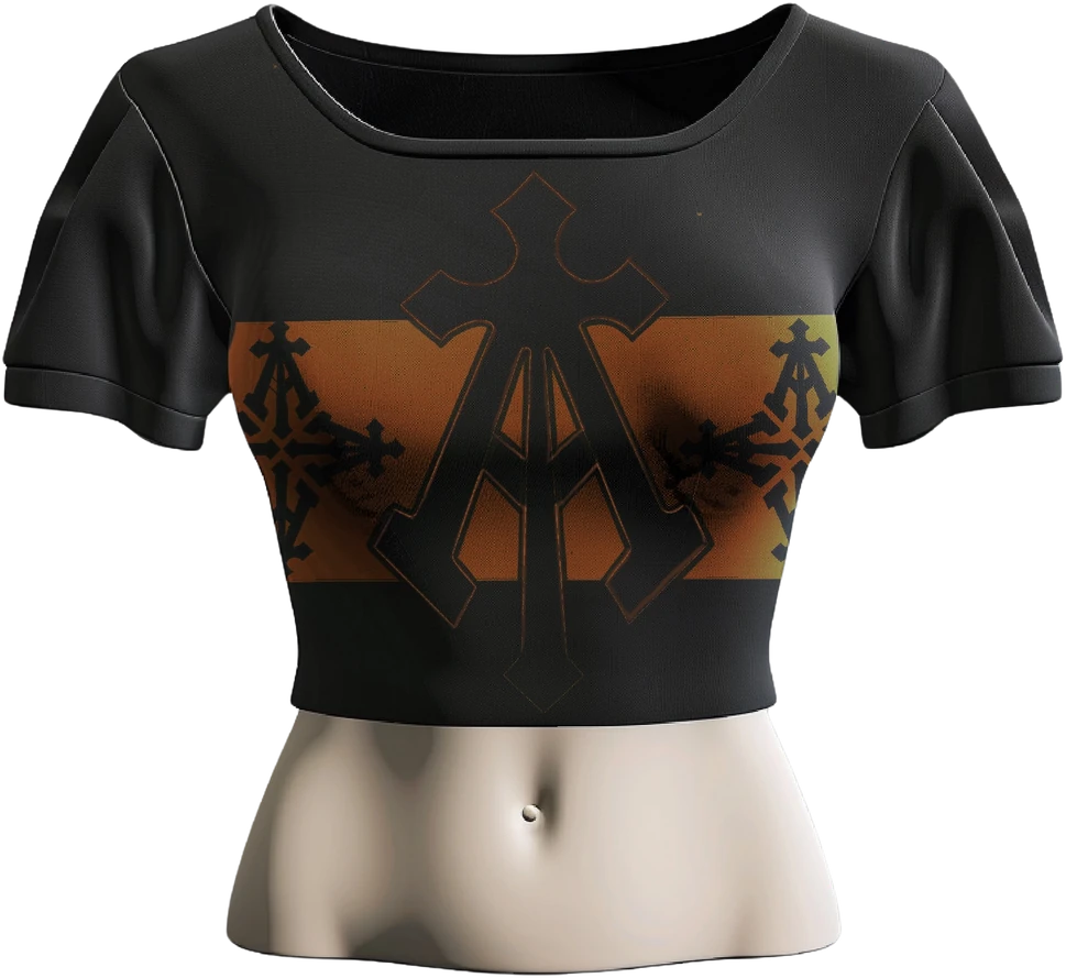
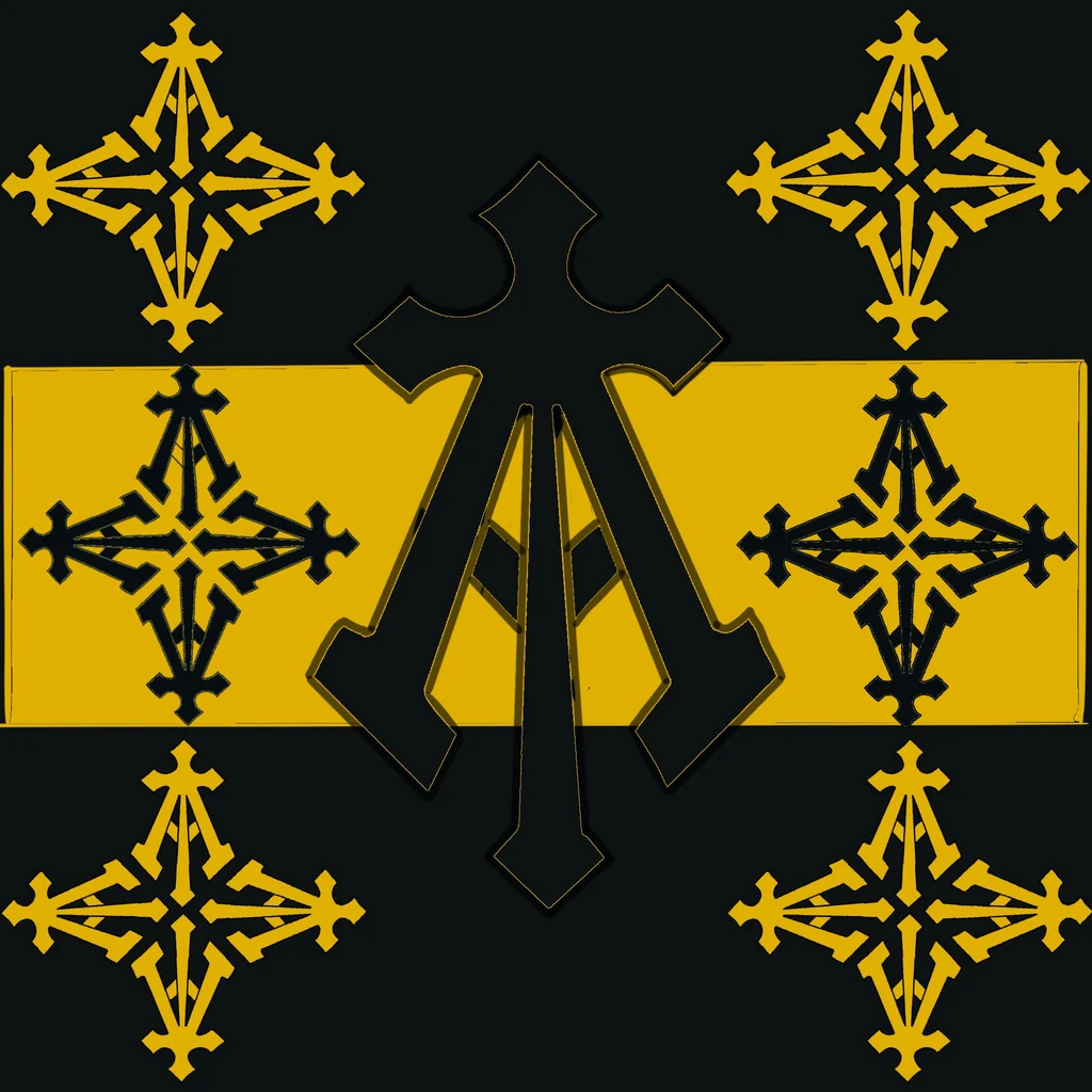
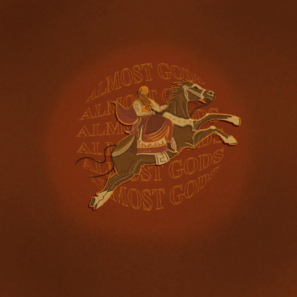
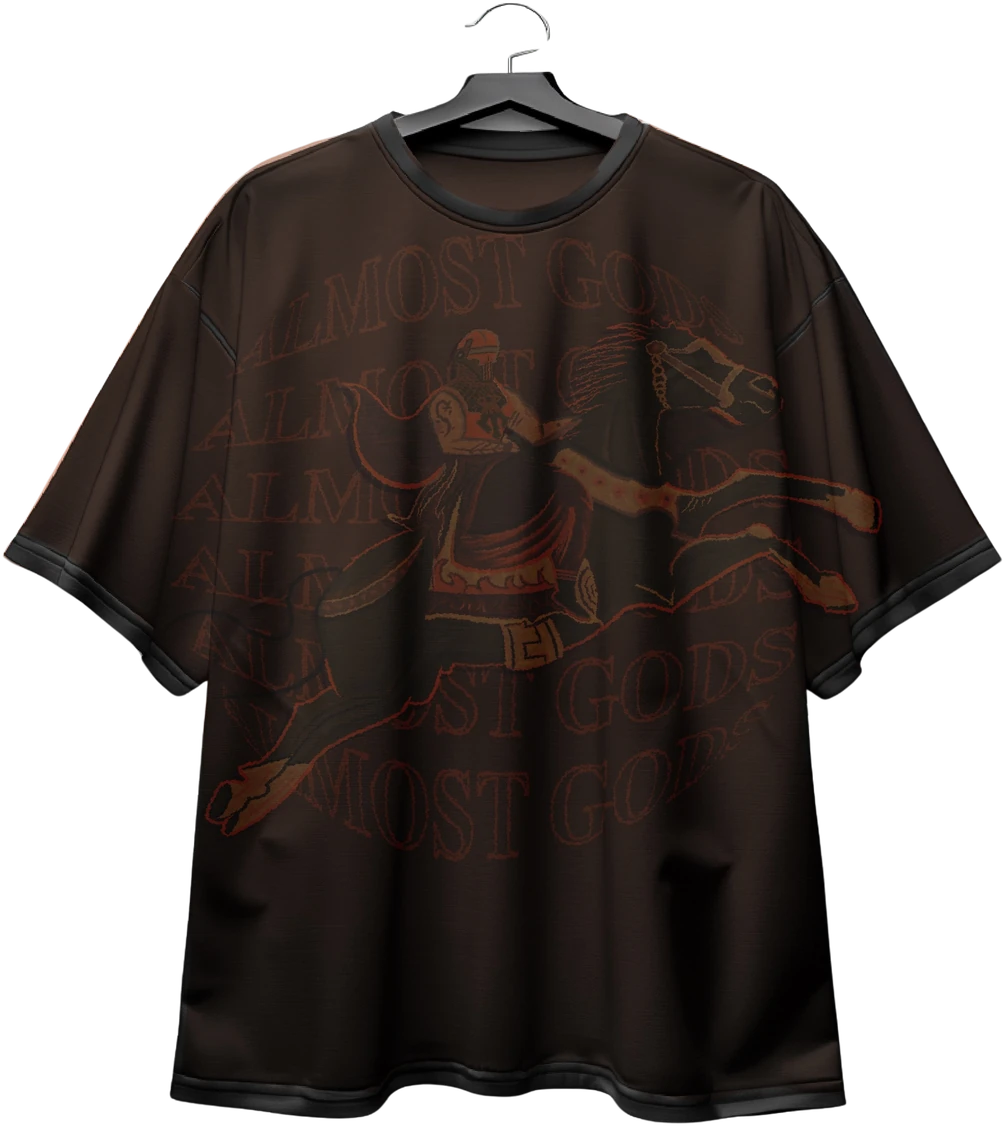
CROP / ALPHA CROSS — SCREEN
The charge at chest scale, spot colour on a dark ground. Screen print: cost scales with colour count, so the mark stays one confident hit.
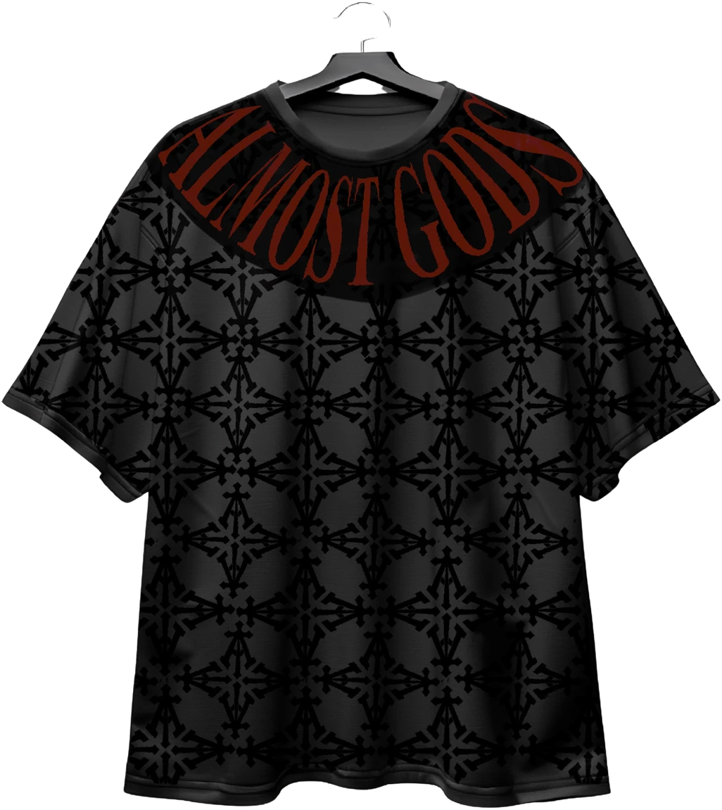
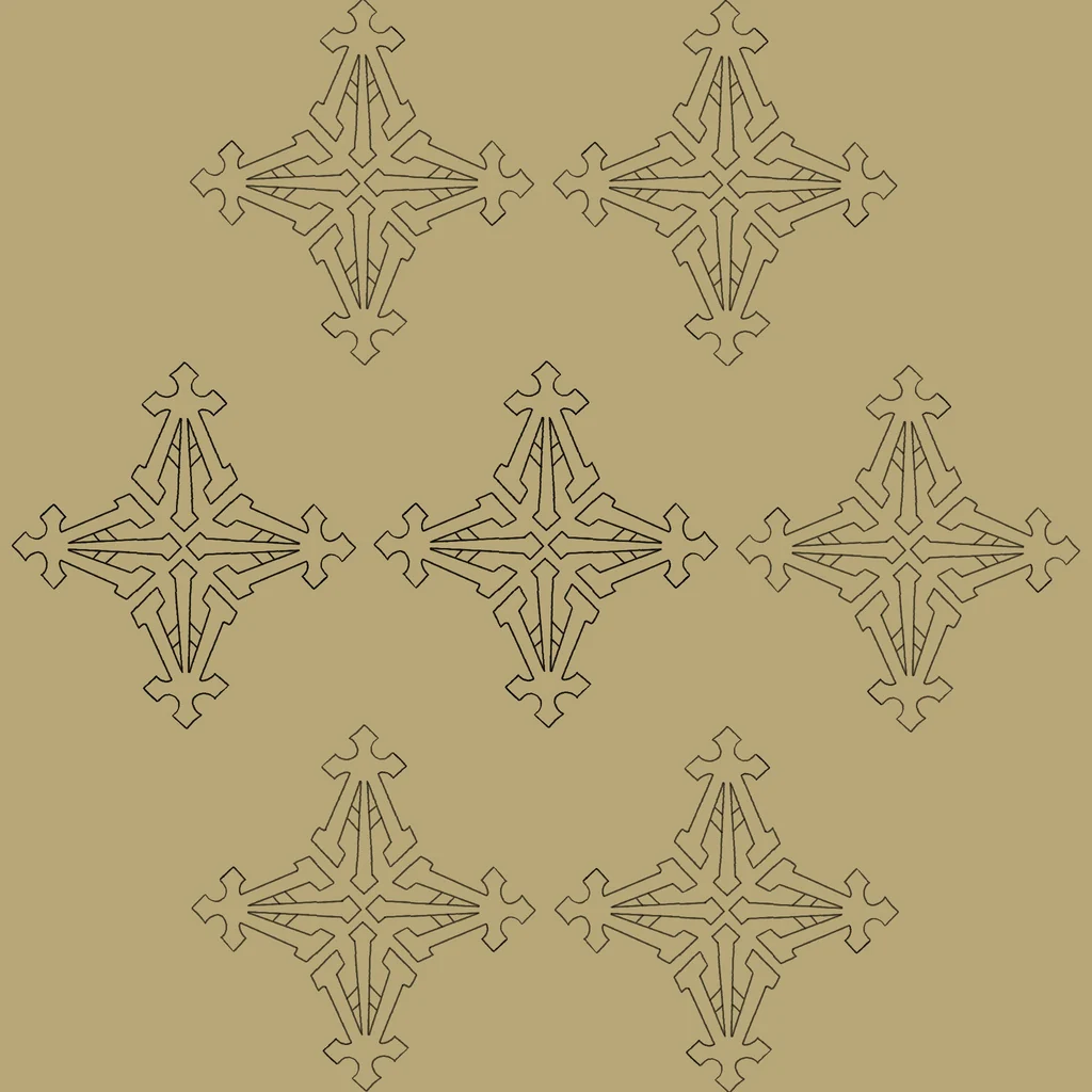
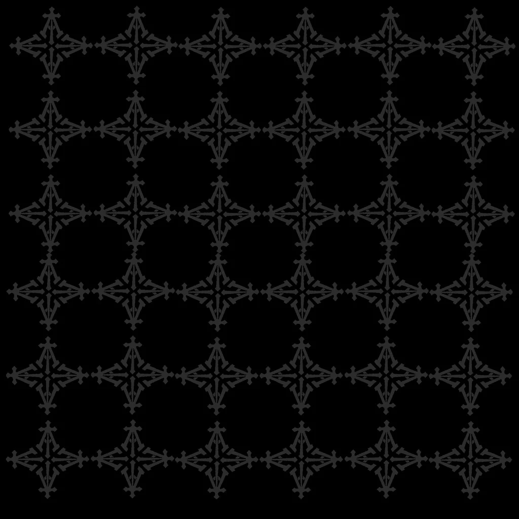
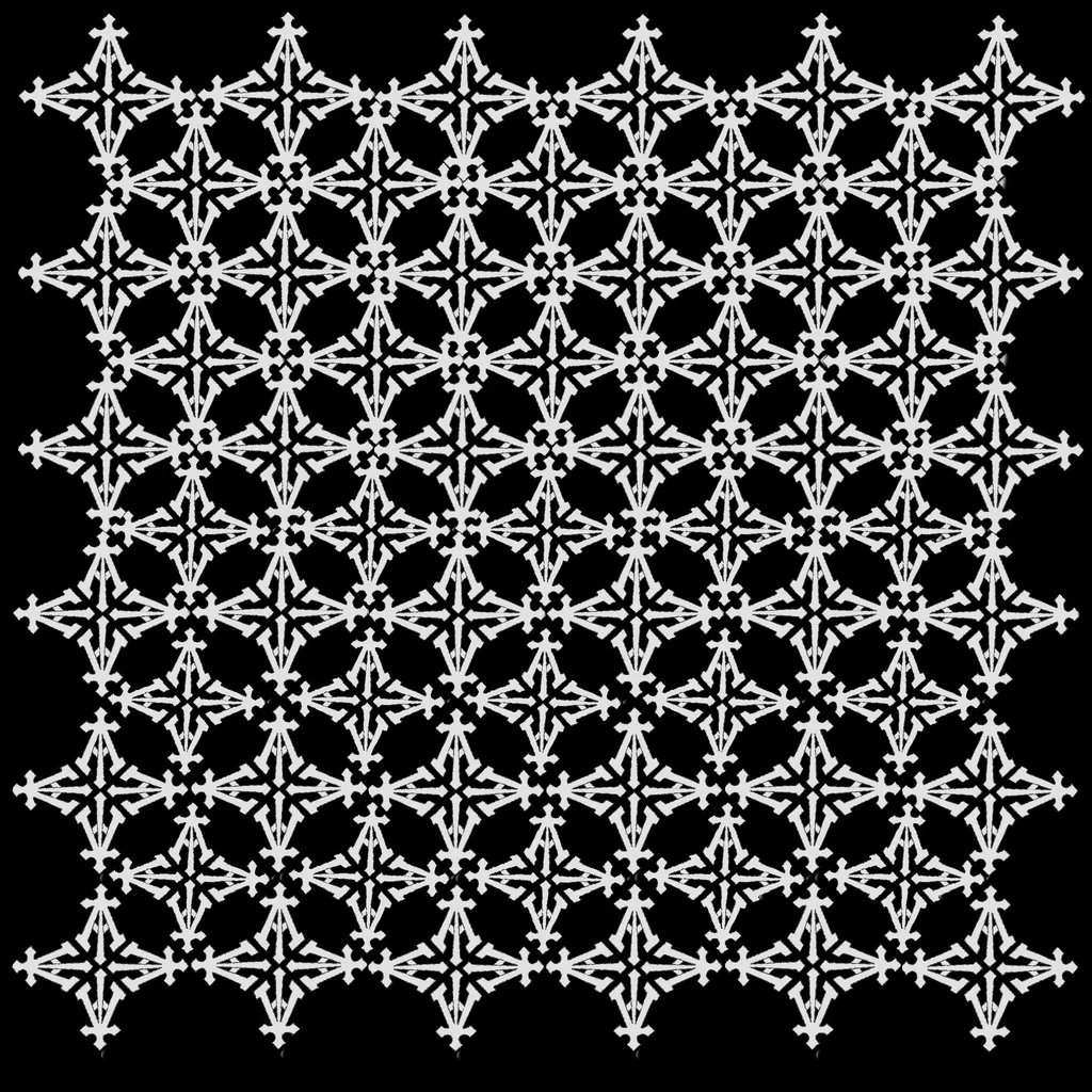
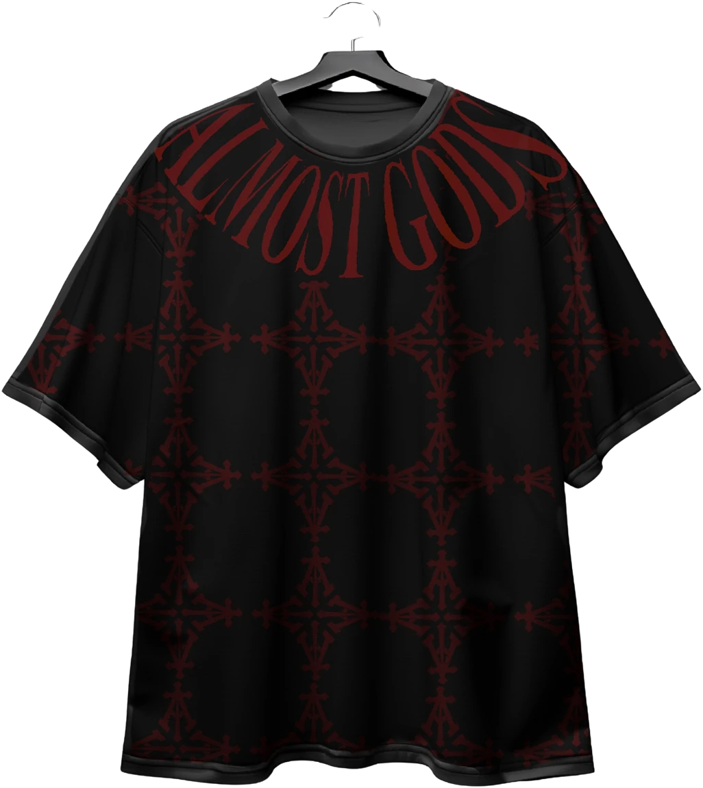
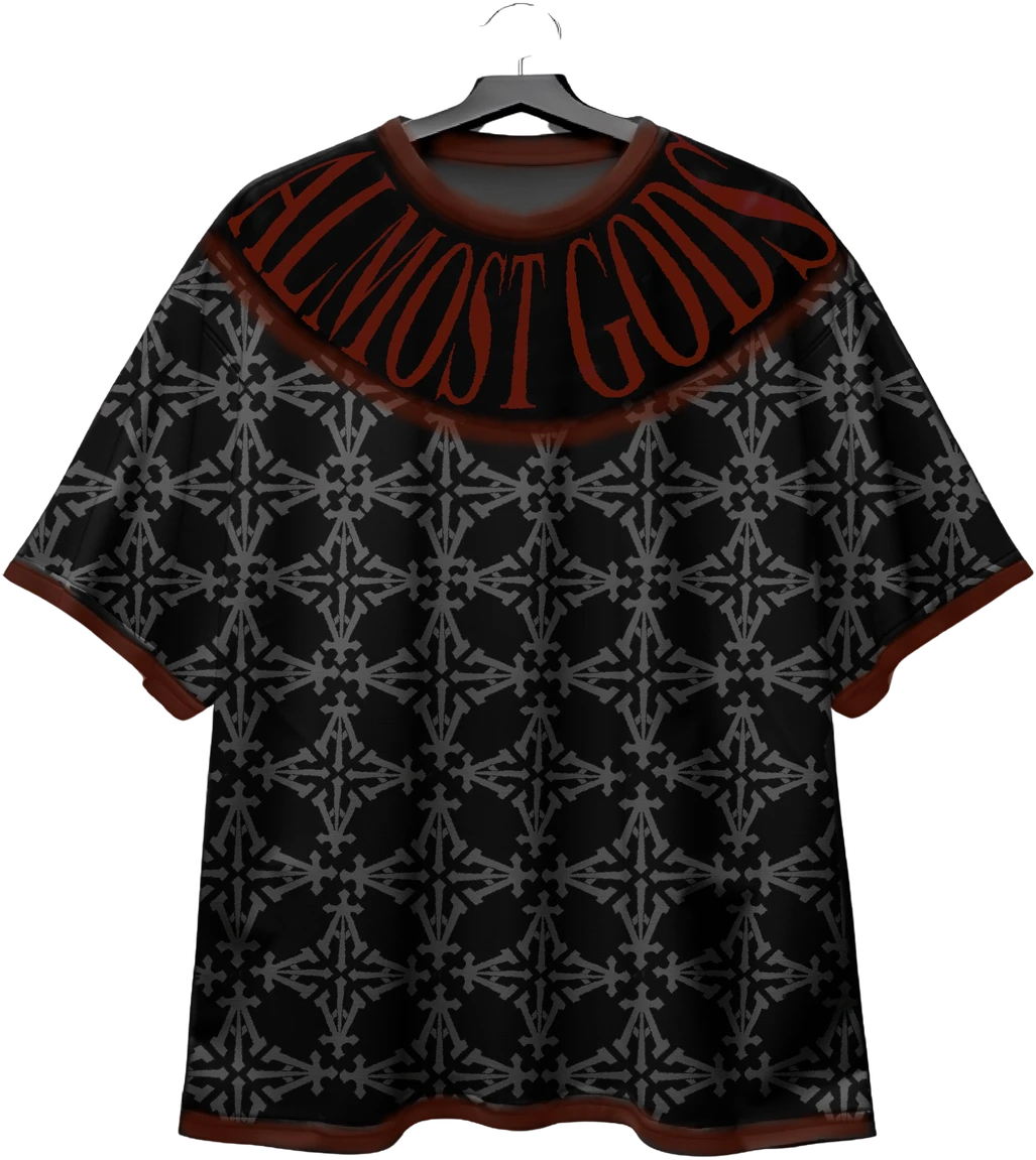
LATTICE TEE / STONE — DTF
A lattice repeat run across the body in a muted stone colourway. DTF carries the multi-tone work the screen would have separated into noise.




10 / WOVEN
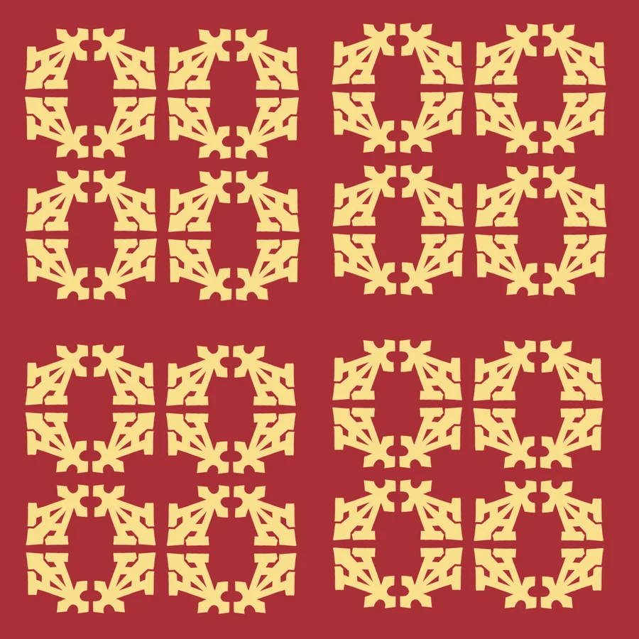
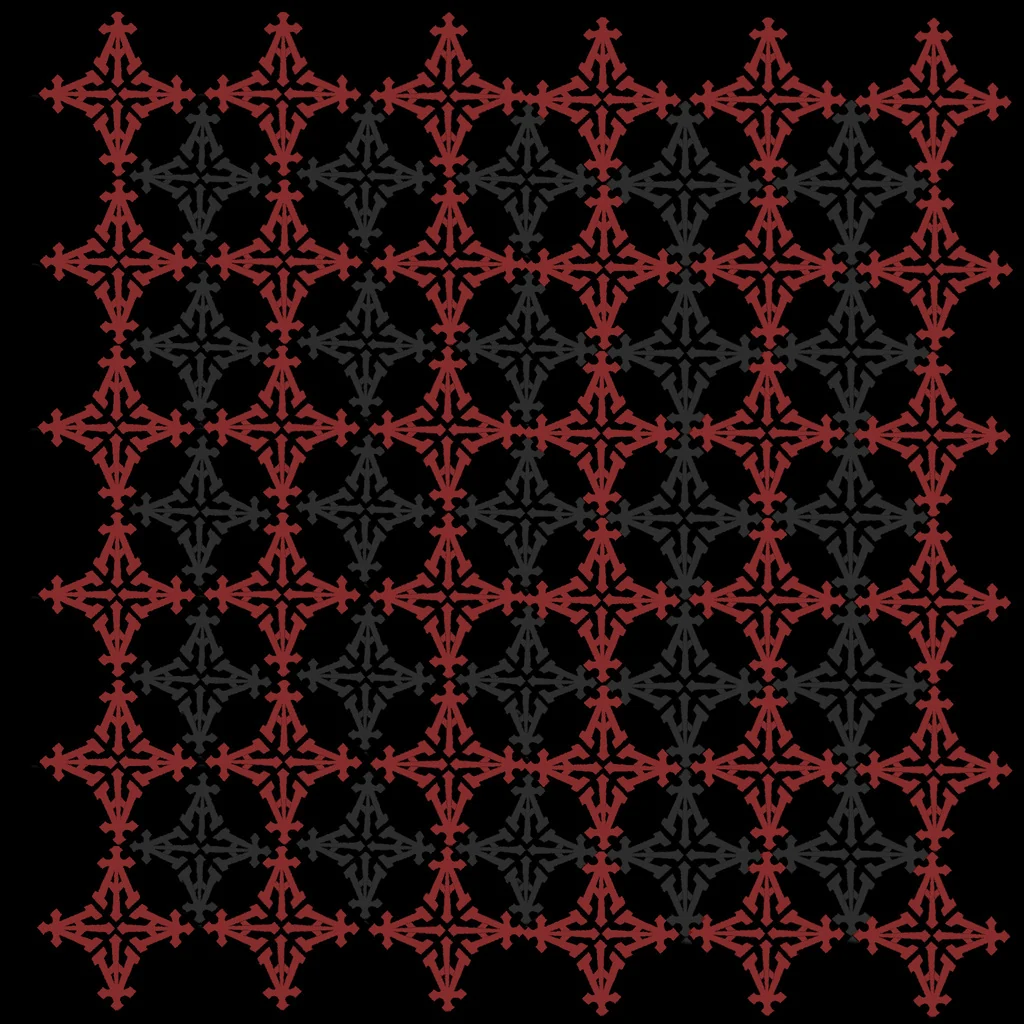
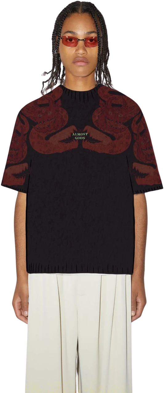
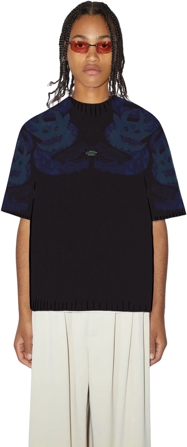
Oxblood, brick, ochre, sand, tarnished gold — low raking single-source light, the twill diagonal always visible.
The woven cloth carries the pieces that need permanence, and it anchors the proposal rather than decorating it.
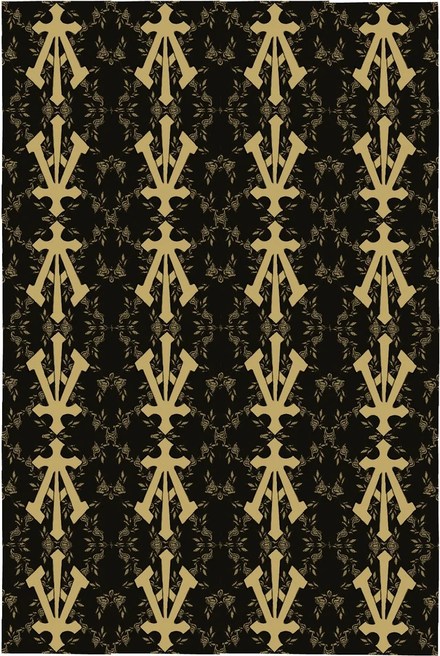
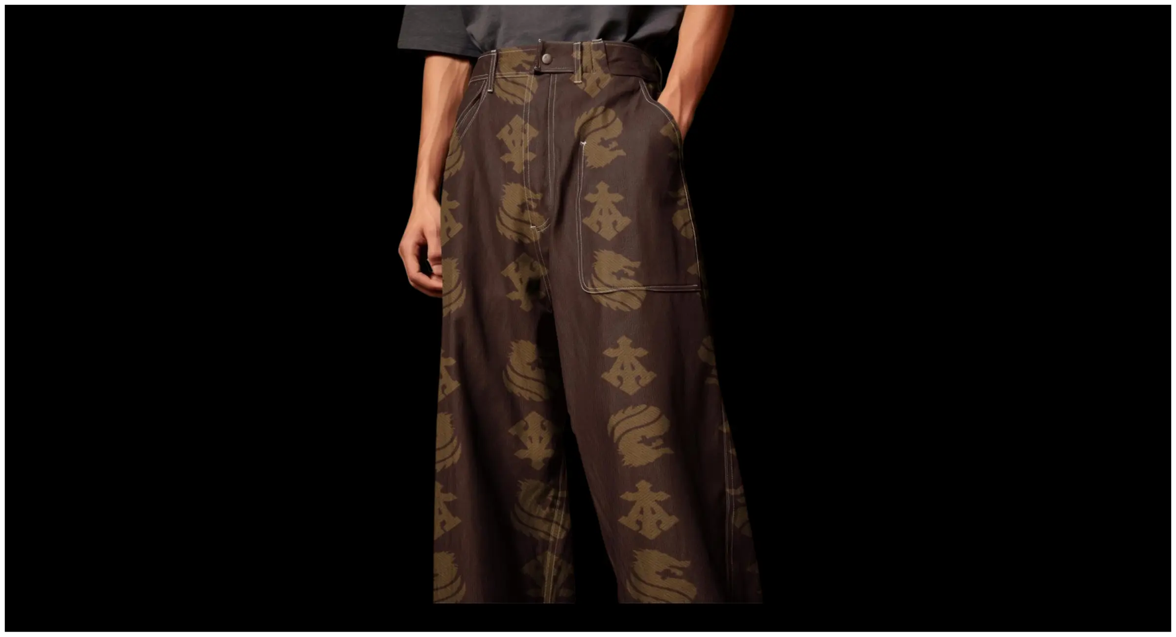
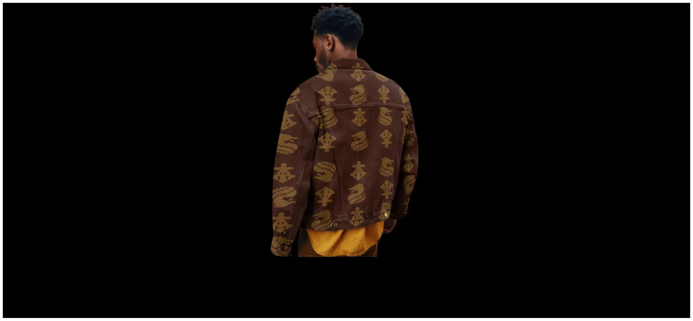
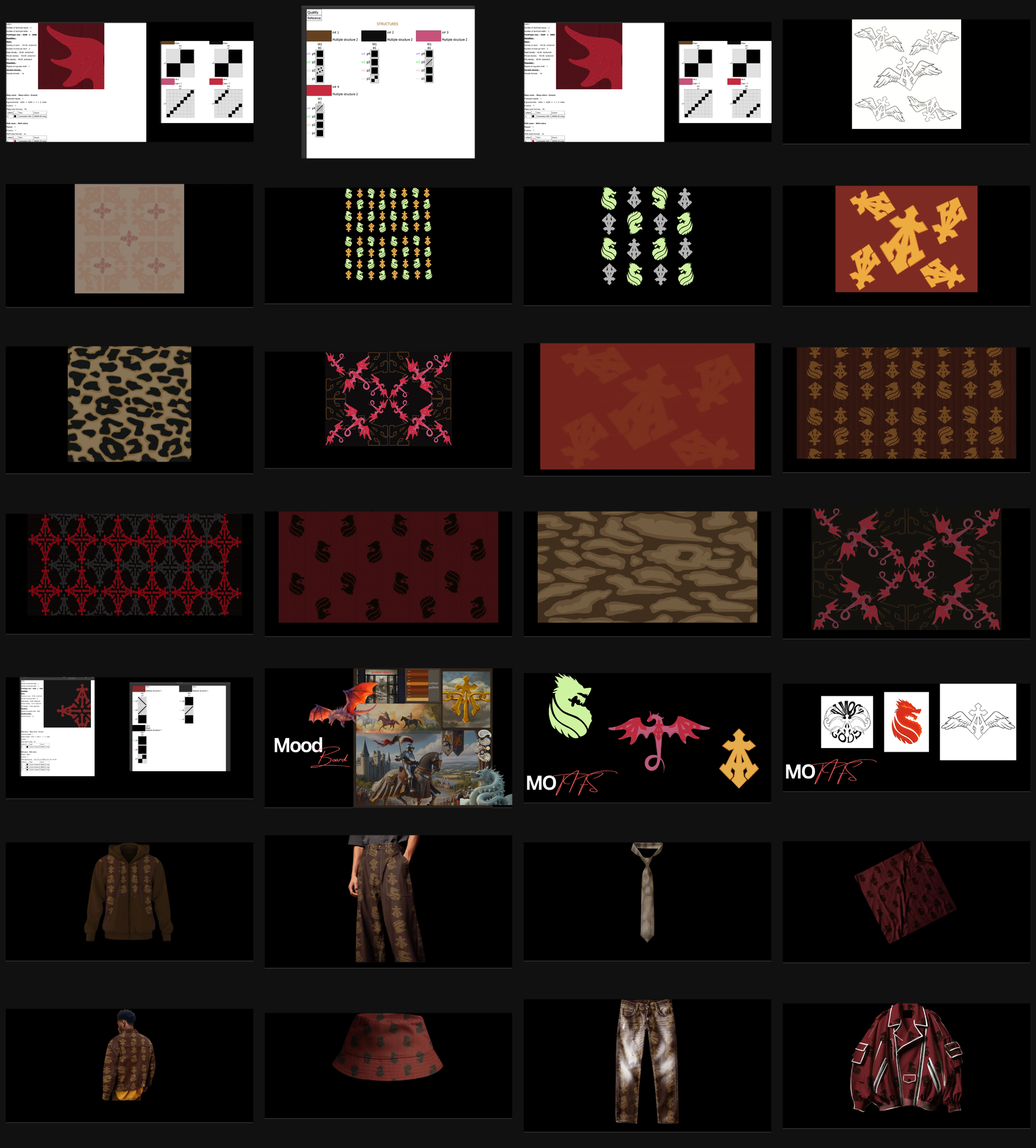
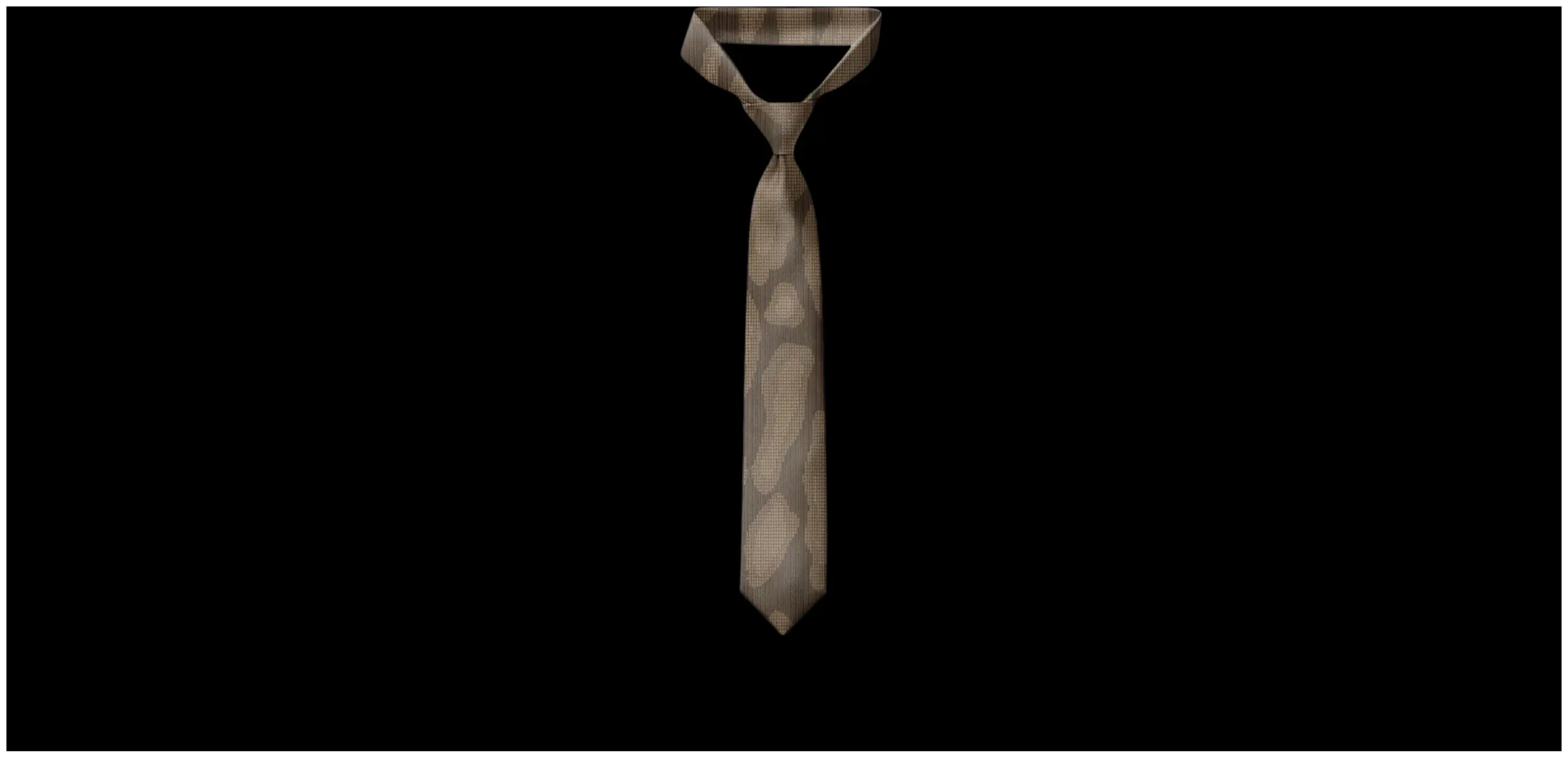
One cloth, many bodies. A jacquard programme is expensive to set up and cheap to repeat, so the economics push toward fewer cloths across more silhouettes. The woven ground runs across hoodie, trousers, jeans, moto jacket, bucket hat, tie and folded cloth.
Structure assigned by density. Plain weave under the open marks. Twill 1/7 — a warp-faced long float — where the ground needs tonal weight without a colour change. Multiple structure 2 where two colourways share a cloth.
The tie is the argument in miniature. A woven tie is the most establishment object in the range and the least streetwear. Putting the armory into that format tests whether the power still reads when the delivery mechanism is formal.
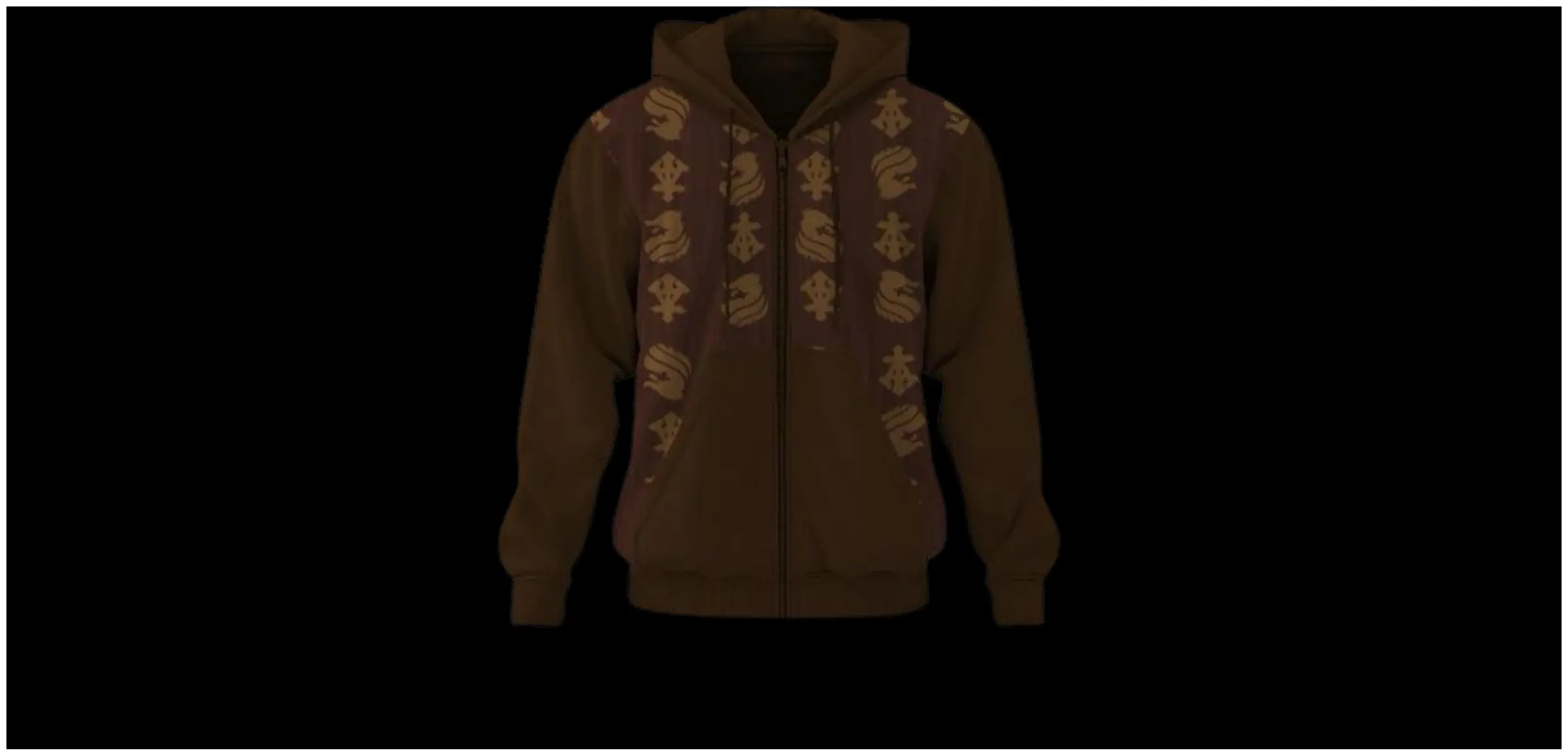
HOODIE / OXBLOOD GROUND — PLAIN
The range anchor: one jacquard cloth worn wide. Plain weave under the open marks keeps the field quiet.
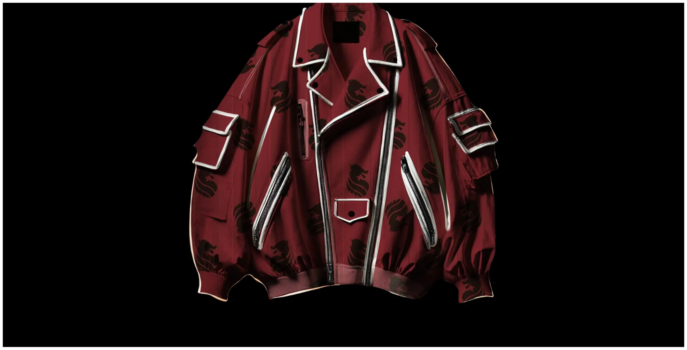
MOTO JACKET / MULTIPLE STRUCTURE 2
Two colourways sharing one cloth, switched by structure rather than print. Multiple structure 2 does the work a second fabric would.
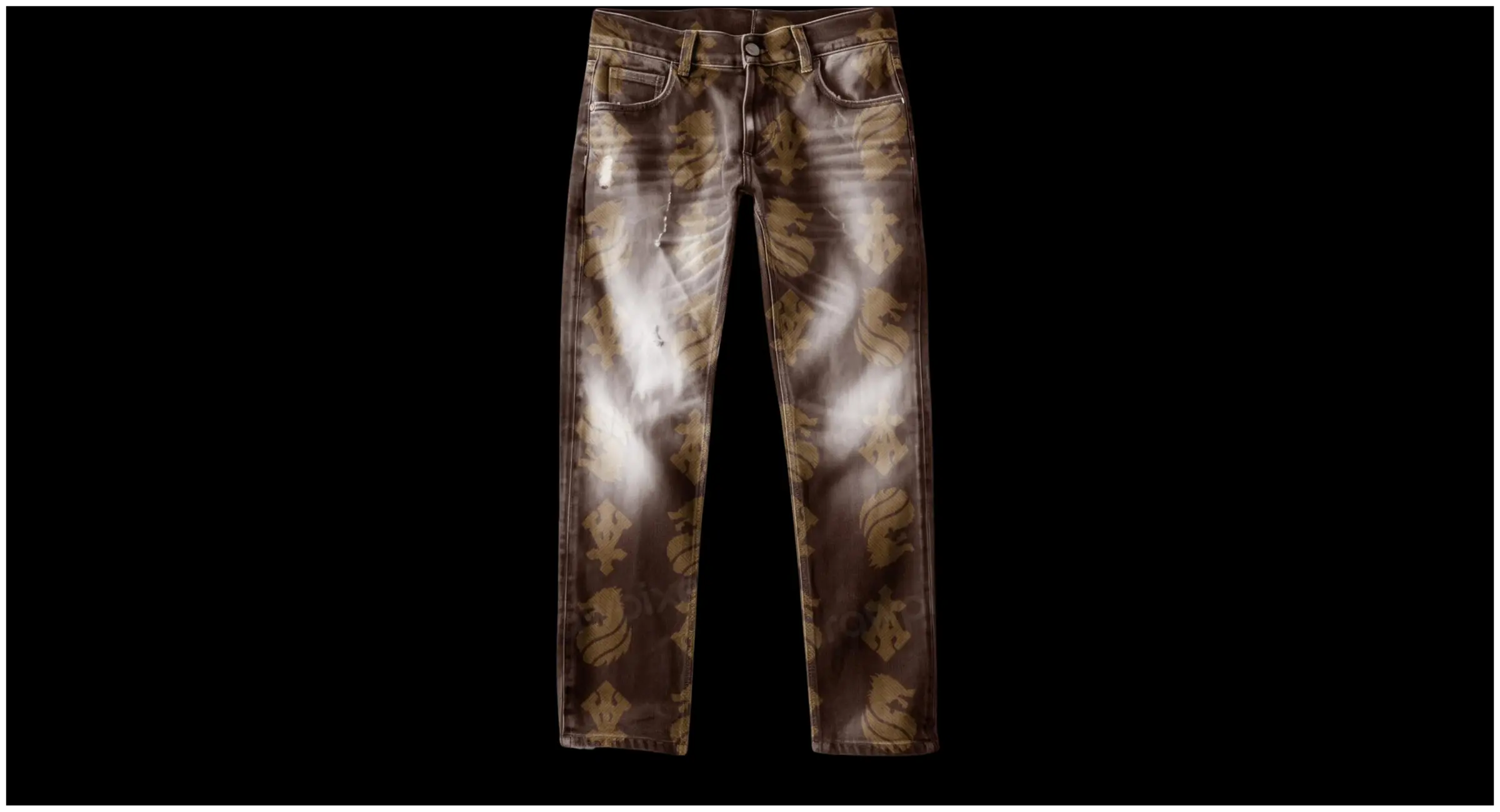
JEANS / CAMO SAND RANGE — TWILL 1/7
The armory abstracted toward camouflage in the sand range. Twill 1/7 gives tonal weight without a colour change.
CLOTH SIMULATION / OCHRE ON OXBLOOD
CAD render at true density — 100 ends by 80 picks per inch — not a photograph. The interlacement is computed, not drawn.
11 / PRODUCT
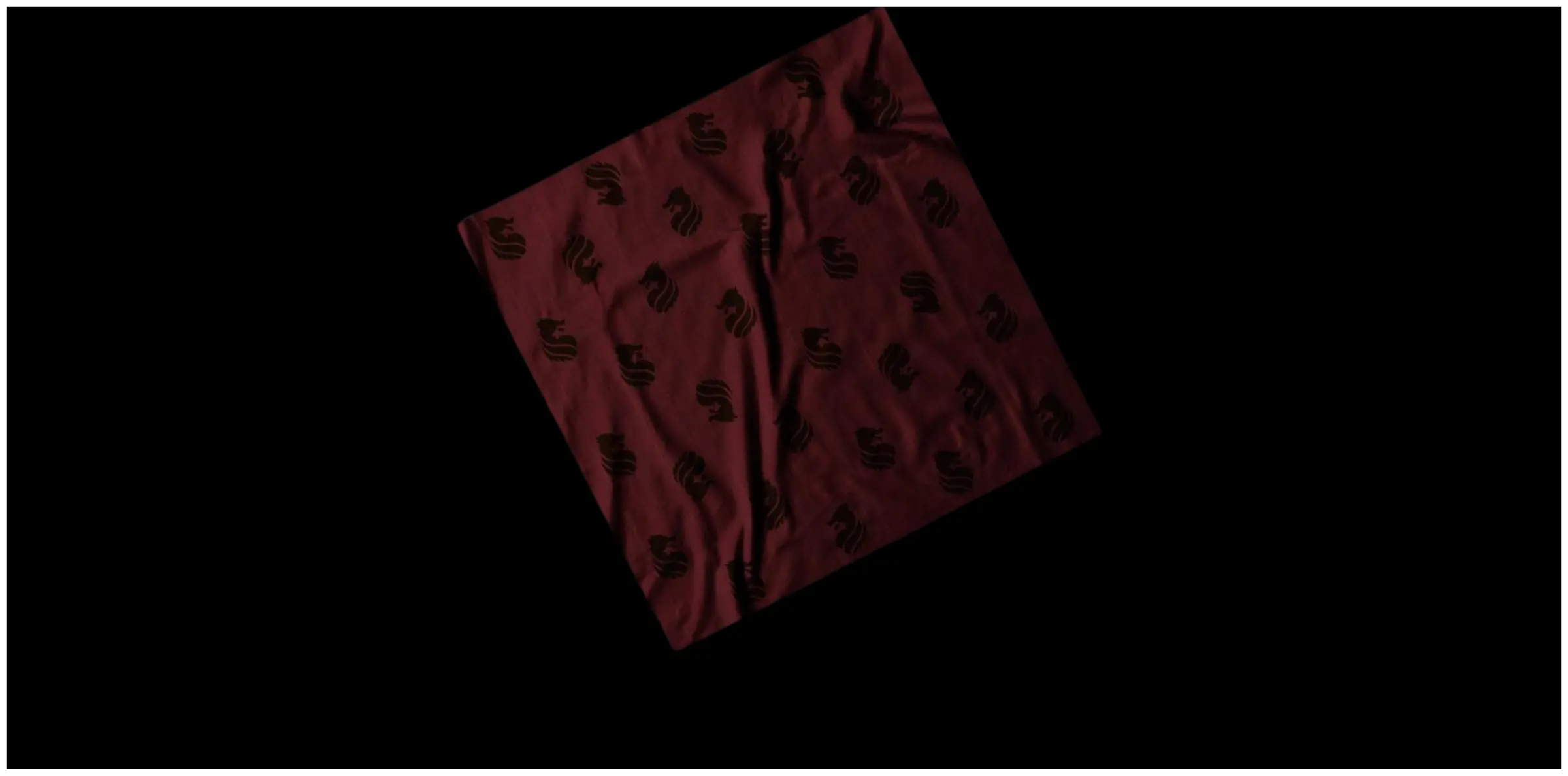
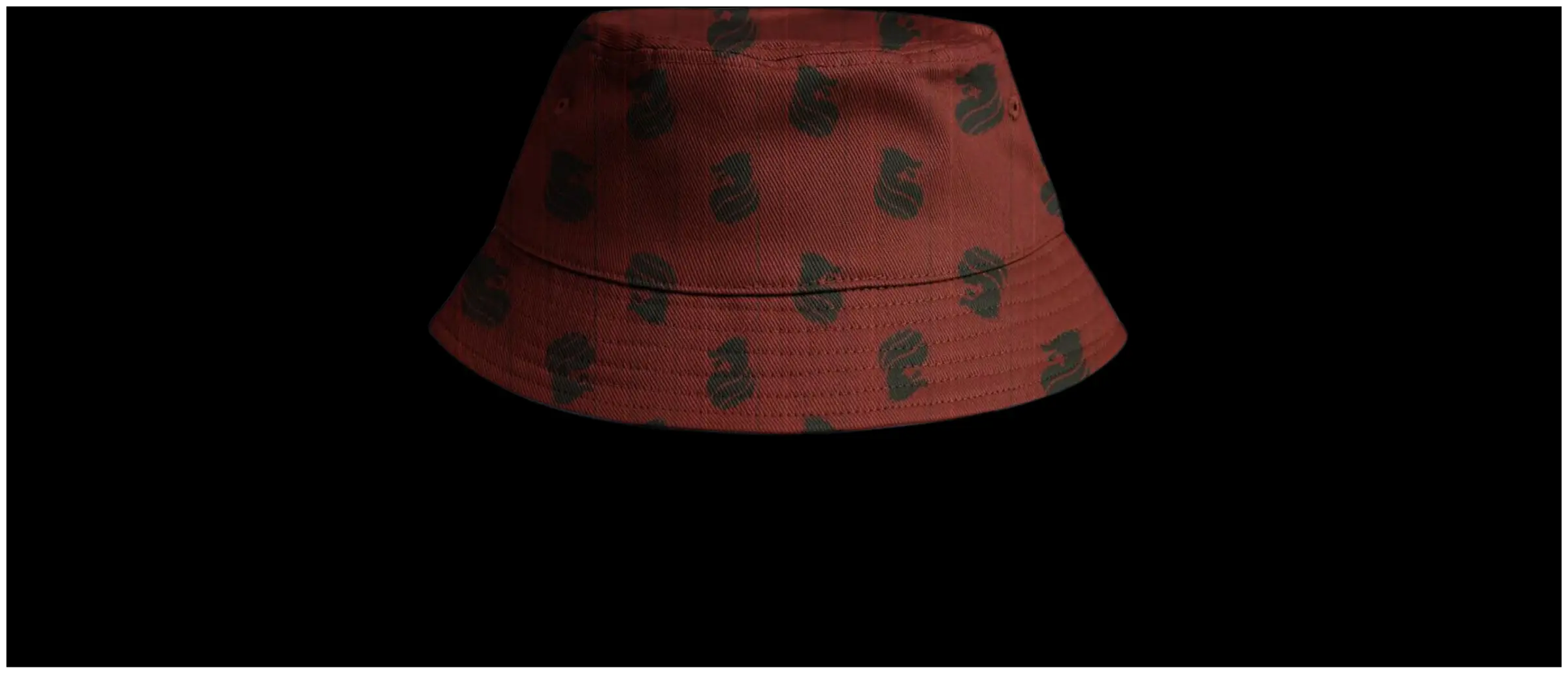
Unreleased and unproduced. No cloth was woven; the simulations are CAD renders at true density, not photographs. This was a response to a brief, and it stayed on paper.
What it proves: that "make prints from our logo" can be answered with a generative system rather than a tiling, and that designing to the loom first sharpens marks rather than degrading them. What it does not prove: hand, drape, weight, cost per metre, or how the tonal structures hold under retail light. Those need a loom and a run.
I would still take the range into weave. A brief about a label whose subject is power deserved an answer in cloth structure, not in mood.
12 / COLOPHON
BLAZON — a response to a design brief set by Almost Gods. Not a released collection. Not commissioned production work. The brief: prints, patterns and seamless designs built from the Alpha Cross. Almost Gods is an independent label operating out of New Delhi, founded 2018 by Dhruv Khurana; the Alpha Cross is theirs. Everything else on this page is the designer's own work.
The case study is a loom. Rather than slides, the study runs the production pipeline as a scroll — mark, method, composition, structure, cloth, product. The page's grid is point paper: the squared graph a jacquard is woven from, one square per interlacement. It densifies as you descend, reaching true density of 100 × 80 exactly at the specification, then dissolving into cloth.
Two sections are live rather than illustrated. In Method, a resolution slider drags one mark down through DTF, digital, screen and finally the loom, shedding a detail tier at each stop until only the silhouette remains. In Structure, selecting Plain, Twill 1/7 or Multiple structure 2 resolves the mark from flat silhouette into interlaced warp and weft, cell by cell.
Form matches subject. A blazon is instructions for reproducing a mark; this page is a blazon you can operate.
Two deliverables. A design document covering brief through product application, and an interactive study that makes the pipeline navigable. The study exists because a PDF cannot show a weave resolving. The argument is that production method carries meaning — which is only demonstrable if you can watch the method happen.
I design systems and build the thing that explains them. This is what that looks like when the system is cloth and the deadline is an interview.
RESPONSE TO A BRIEF · ALMOST GODS · NOT A RELEASED COLLECTION